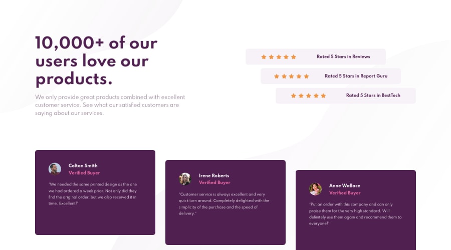
Design comparison
Solution retrospective
First of all, thanks for looking at my code ^^. I had some problems figuring out, how to change both the mobile and desktop design without interfering with each other.I tried to use one media query, but it somehow didnt work. Then i came to the solution to use two media querys. Therefore my css code got way too long(?). Is it practical to do it this way or is there an better alternative. I also want to know, if used "display: flex" too often? Is it bad to do it and why? If there is anything that is worth mentioning, pls do so. I appreciate every comment !
Community feedback
- @GaldinoMatPosted over 3 years ago
Hey man, nice solution! Maybe on next ones try to use a mobile first approach, so the code looks a bit less repetitive and the desktop version comes in a little more naturally. And while I'm still on the same boat as you (newbie projects), I don't think there is any problem in using flexbox that much. I've tried to use css grid but I end up coming back to flexbox lol. The only thing that I would tell you to watch out is the boxes' sizes and font-weight, since they have a lot of impact on the solutions. Cheers!
1@dhakobjaPosted over 3 years agoHey man, thank for the answer! Do u mean by mobile first approach that i should work out the mobile desing first, without using a media query and only use the media query for the desktop design? I tried that, but the code somehow interfered as i said. Need to look further into this .
1
Please log in to post a comment
Log in with GitHubJoin our Discord community
Join thousands of Frontend Mentor community members taking the challenges, sharing resources, helping each other, and chatting about all things front-end!
Join our Discord
