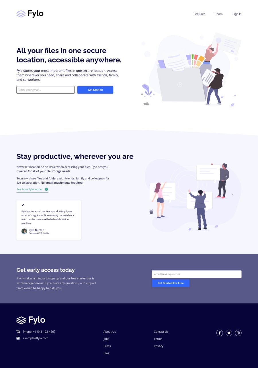
Design comparison
Solution retrospective
For this project, I mostly used flexbox properties for the positioning and layout of the various sections, combined with a container class to set a max-width.
I am content with how the landing page turned out, however, I feel as though my CSS could be refactored into something more efficient (less code). I noticed some spacing/sizing differences in the various sections, which made it difficult to write reusable classes.
Feel free to let me know of any ways that I can write more efficient CSS! Thanks!
Community feedback
- @vanzasetiaPosted over 1 year ago
Hi, Ryan Hemrick! 👋
Alternative text for images should not contain any words related to "image" (such as picture, photo, logo, icon, graphic, or avatar). It is already an image element (
<img>) so the screen reader will pronounce it as an image.Decorative images that are using inline SVG should have
aria-hidden="true"to prevent them from getting pronounced by screen readers.Remove
font-size: 1remfrom the<body>styling. It is already the default styling.I hope this helps. Happy coding! 😄
Marked as helpful1@Ryan-HemrickPosted over 1 year ago@vanzasetia Thank you for your feedback! I was wondering about how to handle inline SVGs for accessibility! Thanks!
0 - @MelvinAguilarPosted almost 2 years ago
Hello there 👋. Good job on completing the challenge !
I'm very sorry that I can't help you with the CSS styles, but I have some small suggestions regarding the accessibility of your website.
- The footer should be outside the main tag.
- The logo image in the footer tag should have an alt attribute, having two logos does not mean that one is purely decorative.
-
Wrap the unordered list (
<ul class="nav-links">in header) in a <nav> tag, this provides additional semantics for the group of links, indicating that it is a navigation section.- After adding a second "nav" tag, you are facing another issue, which is having repeated landmarks. You should use the
aria-labelattribute to describe and identify the navigation and make it unique.
Example:
<nav aria-label="main"> <ul>...</ul> </nav> <nav aria-label="footer"> <ul>...</ul> </nav> - After adding a second "nav" tag, you are facing another issue, which is having repeated landmarks. You should use the
- The
<input type="submit" value="Get Started">should be a button withtype="submit", The button element is a more modern way to use this type of input.
I hope you find it useful! 😄
Happy coding!
Marked as helpful1@Ryan-HemrickPosted almost 2 years ago@MelvinAguilar Thank you for the feedback! All of these make sense
0
Please log in to post a comment
Log in with GitHubJoin our Discord community
Join thousands of Frontend Mentor community members taking the challenges, sharing resources, helping each other, and chatting about all things front-end!
Join our Discord
