

Design comparison

Community feedback
- P@Islandstone89Posted about 1 month ago
Hi, congratulations on finishing another challenge!
I have looked through your code, and I'm happy to see you having a lot of progress - keep it up :)
Here are a few bits of advice:
HTML:
-
<main>holds all of the main content on a page. As a card would likely not be the only component on a page, I would wrap the card content in a<div class="card">inside of<main>. -
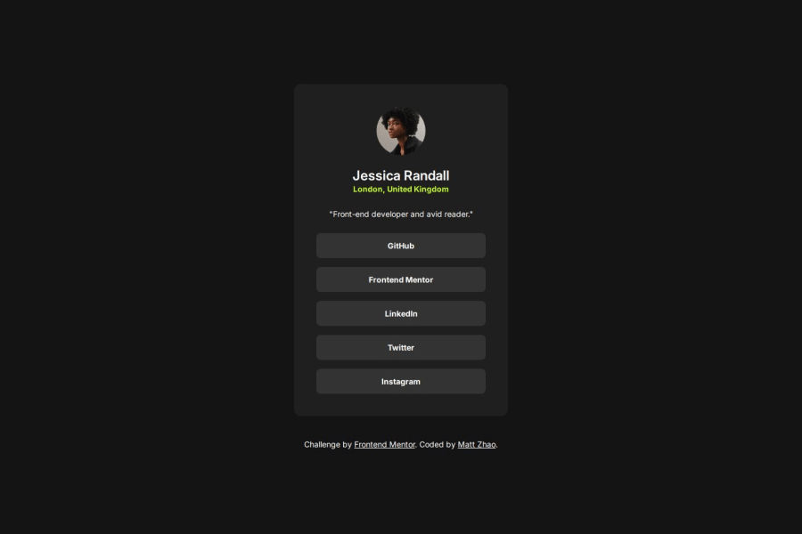
A better alt text for the image is "Headshot of Jessica Randall".
-
I don't think
role="list"is needed on the<ul>, since it has that role by default.
CSS:
-
Remember, the
bodyneeds amin-heightinstead ofheight, as we want it to grow with the content. -
On the card, replace
min-width: 20remwidthmax-width: 20rem. -
Instead of
margin-left: 1.5remandmargin-right: 1.5rem, you can writemargin-inline: 1.5rem. This is more efficient, and you're also using logical properties, which is recommended. NB: On second thought, I would remove themarginon the card and replace it withpaddingon thebody-16pxor1remworks well. -
Remove
width: 100%on.profile-card__header- a<div>is a block element that takes up its parent's full width by default. -
I don't see a need for media queries in this project. Whenever they're needed, they must be in
remoreminstead ofpx.
Marked as helpful1 -
- P@socratesioaPosted about 1 month ago
I like the way you approached the css part of the challenge. It looks pretty nice! Good job!
1


Please log in to post a comment
Log in with GitHubJoin our Discord community
Join thousands of Frontend Mentor community members taking the challenges, sharing resources, helping each other, and chatting about all things front-end!
Join our Discord