

Design comparison

Community feedback
- P@Islandstone89Posted about 1 month ago
HTML:
-
<main>holds all of the main content on a page. As a card would likely not be the only component on a page, I would wrap the card content in a<div class="card">inside of<main>. -
You don't need to wrap the image in a
<div>. -
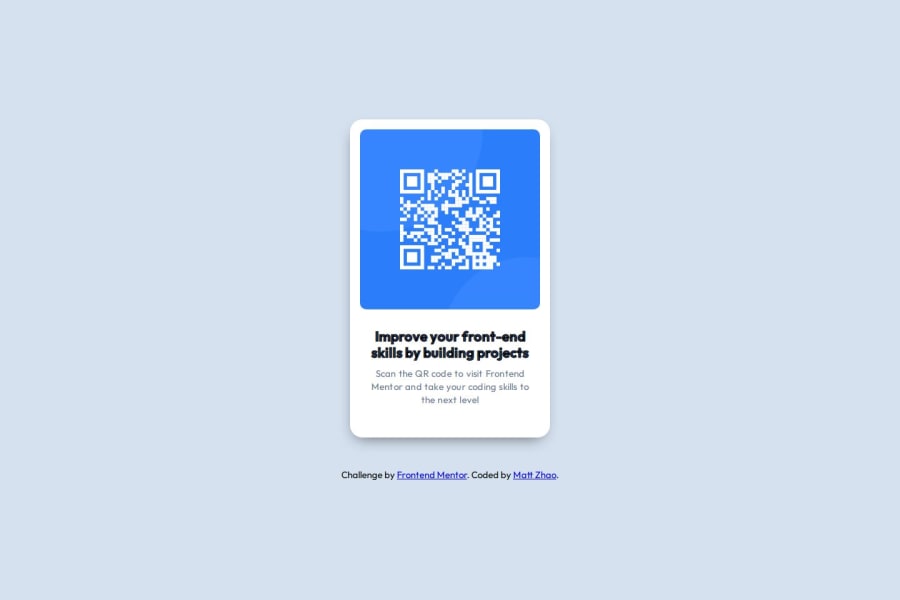
The alt text must also say where it leads(the frontendmentor website). A good alt text would be "QR code leading to the Frontend Mentor website."
-
I would change the heading to a
<h2>- a page should only have one<h1>, reserved for the main heading. As this is a card heading, it would likely not be the main heading on a page with several components. -
Text should always be wrapped in a meaningful element, never in divs alone. Hence, the footer text needs to be wrapped in a
<p>.
CSS:
-
Make a habit of including a modern CSS Reset at the top of the stylesheet.
-
I recommend adding a bit of
padding, for example16px, on thebody, to ensure the card doesn't touch the edges on small screens. -
On the
html, removefont-size: 62.5%- this article explains why changing the root font size is a bad idea. -
With this removed, you need to adjust the font sizes. You probably don't need to do too much, as the element's default sizes are suitable.
-
Descendant selectors like
.info-block pincrease specificity, making the styles harder to override. It's best practice to instead give elements a class, and use that as the selector. -
On the card, you have declared
gaptwice, so remove one of them. -
Remove the
widthon the card. We rarely want to give a component a fixed size, as we need it to grow and shrink according to the screen size. -
We do want to limit the width of the card, so it doesn't get too wide on larger screens. To solve this issue, give the card a
max-widthof around20rem. -
It's fine to use
%forline-height, but you can also give it a unitless value - instead of120%, I write1.2. -
letter-spacingmust not be inpx. You can useem, where1emequals the element's font size. -
Since all of the text should be centered, you only need to set
text-align: centeron the body, and remove it elsewhere. The children will inherit the value. -
Paragraphs have a default value of
font-weight: 400, so there is no need to declare it. -
You can remove
font-style: normal, as that is the default value. -
The declaration on
.info-blockhas invalid syntax:padding: 0, 1.2rem;must be written like so :padding: 0 1.2rem; -
On the image, add
display: block, and changeheight: 100%toheight: autoandwidth: 100%tomax-width: 100%- the max-width prevents it from overflowing its container. Without this, an image would overflow if its intrinsic size is wider than the container.max-width: 100%makes the image shrink to fit inside its container.
Marked as helpful0P@MattzicPosted about 1 month ago@Islandstone89 I truly appreciate your thorough and helpful comment. I was not even expecting such a detailed response, and I'm really grateful. Thank you!
1 -

Please log in to post a comment
Log in with GitHubJoin our Discord community
Join thousands of Frontend Mentor community members taking the challenges, sharing resources, helping each other, and chatting about all things front-end!
Join our Discord