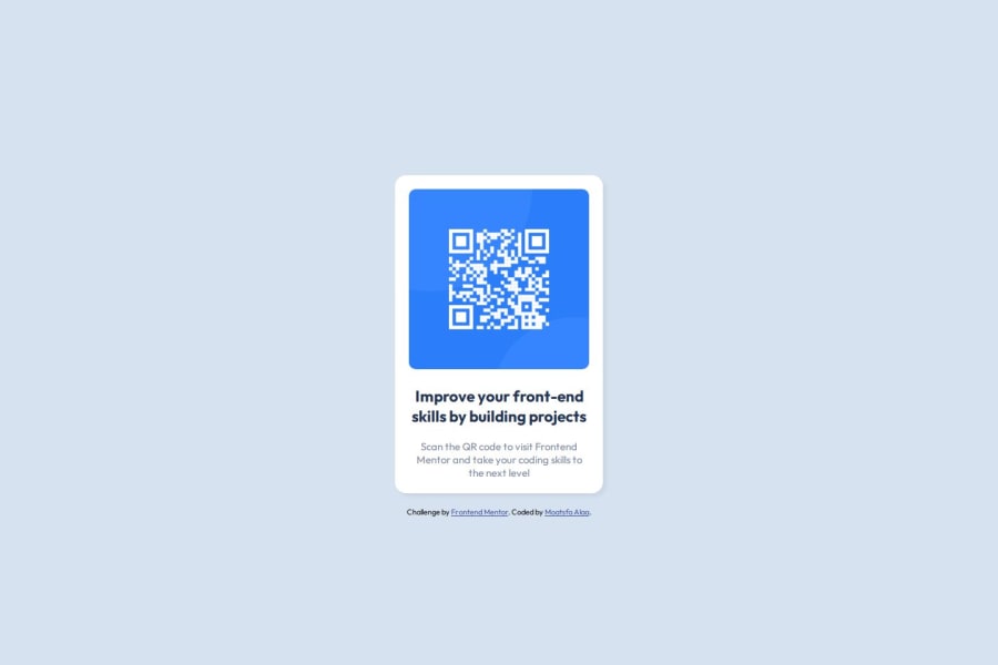
Design comparison
Community feedback
- P@TranDanh1122Posted 3 months ago
Thật good, bút maybe you can improve something:
- No need center card with margin 16px, if you need center x, use margin 0 auto, if need x and y, just use flex box for parent.
- When you import font, try import only which font weight you need, that will cause performance issue if you import like now in real life project
Marked as helpful0 - @devceejayPosted 3 months ago
Hello! @omar25876 good job on completing the project but I have an observation.. on mobile viewing I noticed your card is not centered.. you should work on its Responsiveness.
Also, while going through your code, I see you didn't make use of Semantic HTML to structure your code. Using divs is quite okay but using Semantic HTML best structures your code well for easy readability and understanding of which it is also great for SEO (Search Engine Optimization) and accessibility. Don't always neglect using Semantic HTML to properly define the structure of your web pages/projects.
I hope you find this feedback helpful.
Happy Coding!
Marked as helpful0@Omar25876Posted 3 months ago@devceejay thanks for your notes will check it 😄
0 - @MolinaEfPosted 3 months ago
Seems like u wanted to do something different so I cant really comment I'd still add some margin-top to ur subtext so it looks better
Marked as helpful0 - @M1roelPosted 3 months ago
Looks great.
0
Please log in to post a comment
Log in with GitHubJoin our Discord community
Join thousands of Frontend Mentor community members taking the challenges, sharing resources, helping each other, and chatting about all things front-end!
Join our Discord
