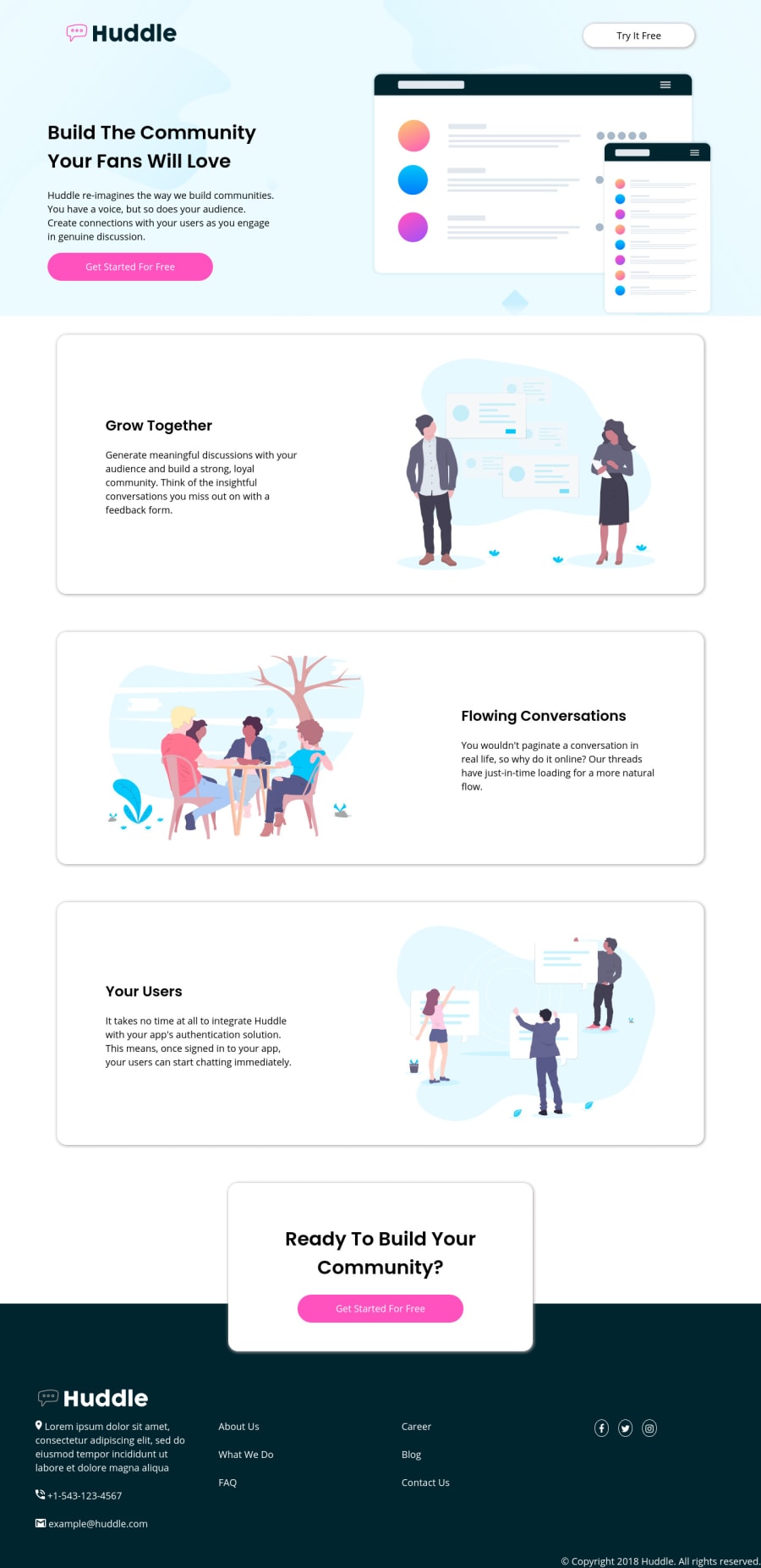


Design comparison
SolutionDesign

Solution retrospective
Any suggestion on responsiveness on mobile devices is highly appreciated. I can make my site look okay on desktop and laptop but struggle with small screens. Thanks.
Community feedback
- @hafizanadliPosted over 3 years ago
Looks good in desktop view. You should make another media queries styling for smaller viewport. Reduce mergin value when in mobile view, the current margin is too big for mobile view.
Keep up the great work!
1@FahimMahmudJoyPosted over 3 years ago@hafizanadli Thanks for the suggestion. Will look into that. And that 'looks good' means so much to me, it just levels up the confidence and spirit of work.
1

Please log in to post a comment
Log in with GitHub
Join our Discord community
Join thousands of Frontend Mentor community members taking the challenges, sharing resources, helping each other, and chatting about all things front-end!
Join our Discord