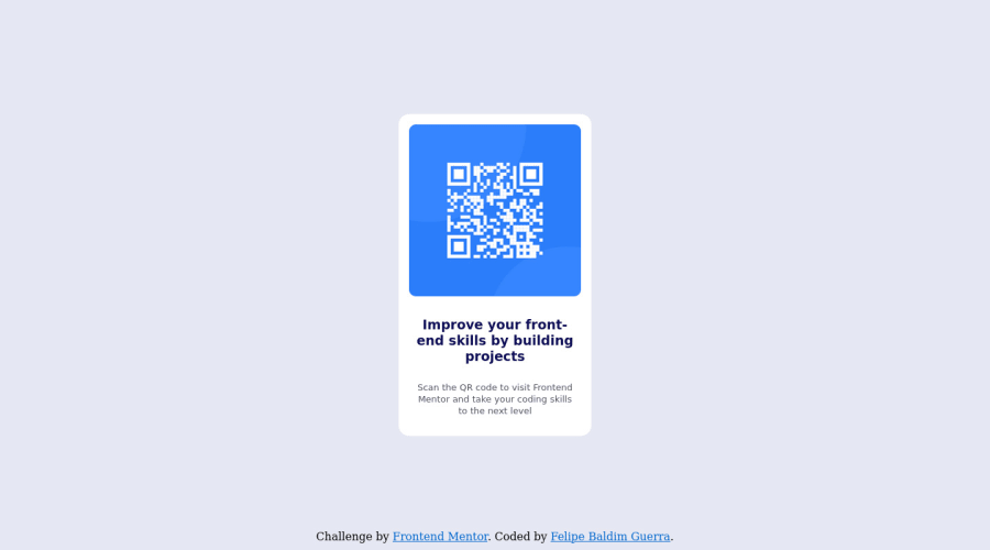
HTML and CSS responsive QR Code Component
Design comparison
Solution retrospective
Is there a better way to do responsive component instead of?
@media only screen and (max-width: 750px) and ( orientation: landscape){
}
@media only screen and (max-width: 450px) and ( orientation: portrait){
}
What is the good pratice and where could I study it?
Any other points, critics and comments will be appreciated!
Community feedback
- @Finney06Posted over 1 year ago
Hello there 👋. Good job on completing the challenge !
Here are some suggestions regarding your code that may be of interest to you.
HTML 🏷️:
To clear the Accessibility report:
-
Wrap the page's whole main content in the
<main>tag. -
Always avoid skipping heading levels; Starting with
<h1>and working your way down the heading levels (<h2>,<h3>, etc.) helps ensure that your document has a clear and consistent hierarchy. -
Use HTML5 semantic elements such as
<header>,<nav>,<main>,<aside>, and<footer>to define these sections.
Here is a web accessibility evaluation tool📕 to check your webpage for any remaining errors or warnings related to landmarks.
I hope you find it helpful!😏 Above all, the solution you submitted is 👌. 🎉Happy coding!
Marked as helpful0 -
Please log in to post a comment
Log in with GitHubJoin our Discord community
Join thousands of Frontend Mentor community members taking the challenges, sharing resources, helping each other, and chatting about all things front-end!
Join our Discord
