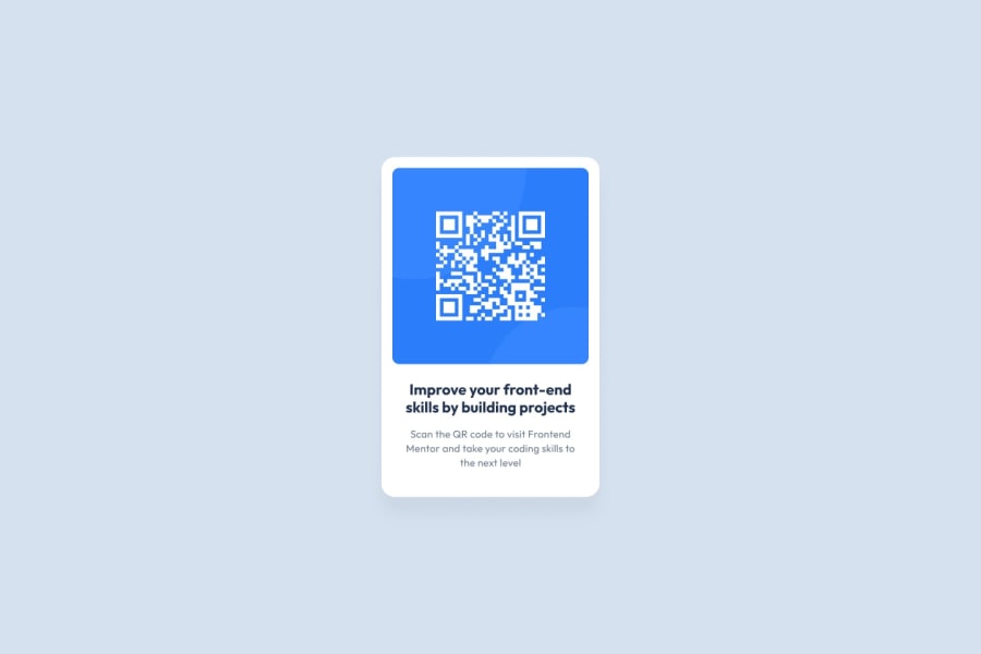
Design comparison
Community feedback
- @cj6046Posted 27 days ago
This is a good start, but I'd suggest the following:
- You can add in the font provided and set your background color the provided hsl to help match the design.
- I guessed at the font-size properties by examining where the line breaks were on the page.
- Lastly, some more descriptive alt text and h1 tags will help with accessibility!
Great job getting started!
1 - @DmitryIsTryingPosted 27 days ago
It would be better to wrap the following in a separate container:
<h2>Improve your front-end skills by building projects</h2>
<p>Scan the QR code to visit FrontEnd Mentor and take your coding skills to the next level</p>
Using
padding-left: 0px; padding-top: 20px; padding-bottom: 20px; padding-right: 0px;is generally not a good practice because it’s inconvenient. Read about how to set padding for all sides using justpadding: 1px 1px 1px 1px;(for example).Don't write margin: 0; and padding: 0; for every block; instead, use:
* {
    padding: 0;
    margin: 0;
}
This way, you’ll set zero margins for all elements, and then override them where necessary.
The image sizes are incorrect. The height should specify px.
The design uses the Outfit font, and it needs to be downloaded from Google Fonts. Read about how to do this!
Overall, try not to hardcode the width and height, as this is generally a bad practice for the responsiveness of the website.
0
Please log in to post a comment
Log in with GitHubJoin our Discord community
Join thousands of Frontend Mentor community members taking the challenges, sharing resources, helping each other, and chatting about all things front-end!
Join our Discord
