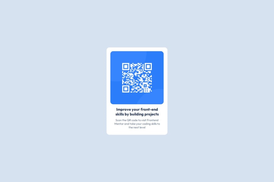
Design comparison
Solution retrospective
After a year working as a Salesforce developer, it was so refreshing to make something out of pure HTML and CSS without having to worry about limitations.
What challenges did you encounter, and how did you overcome them?Reviewing pure CSS attributes. In Salesforce and many other frameworks image implementation is automatically made in the majority of the time, so something as simple as making the image fit the container was a struggle, but after playing around for a bit, I've managed to make it work.
What specific areas of your project would you like help with?Best practices and code optimization
Community feedback
- @Brown-codesPosted 7 months ago
I think the layout looks good and the code is well-structured.
1 - @Extendo99Posted 7 months ago
I will use the h1 tag in HTML because it is the main header in the project.
CSS styles should be in an external stylesheet.
The code is well-structured, in my opinion.
The solution is slightly smaller than the design.
1 - P@Mario-jesusPosted 7 months ago
Buen trabajo, solo te falto establecer un min-height de 499px a la tarjeta
1
Please log in to post a comment
Log in with GitHubJoin our Discord community
Join thousands of Frontend Mentor community members taking the challenges, sharing resources, helping each other, and chatting about all things front-end!
Join our Discord
