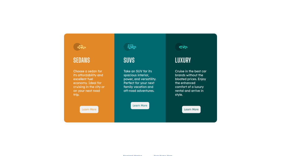
Design comparison
Solution retrospective
let me know your feedback please
Community feedback
- @ChamuMutezvaPosted over 3 years ago
- for the class
.work_arearemove theheightin all the declarations and set it tomin-height: 100vh - put some focus effects on the button to indicate when it is focused
0@Amirmardan-progPosted over 3 years ago@ChamuMutezva Thanks for your feedback. appreciate it. I applied your opinions but I can't see the new version here by generating the new report. the new page is available here https://3-column-preview-card-component-main-1ssfa800j-amirmardan-prog.vercel.app/
0@ChamuMutezvaPosted over 3 years ago@Amirmardan-prog , looks better now. The reason i suggested so , was because the mobile version was not shown in full. The top card was cut off. One last issue is to see if you can improve the display of the cards in particular for medium devices. Tips:
- set a max-width for all the cards (
.total_sedan, ._total_SUVS, .total_luxury) egmax-width: 25rem. so that the cards do not over stretch. Apply margin auto to keep them centered.
0 - for the class
Please log in to post a comment
Log in with GitHubJoin our Discord community
Join thousands of Frontend Mentor community members taking the challenges, sharing resources, helping each other, and chatting about all things front-end!
Join our Discord
