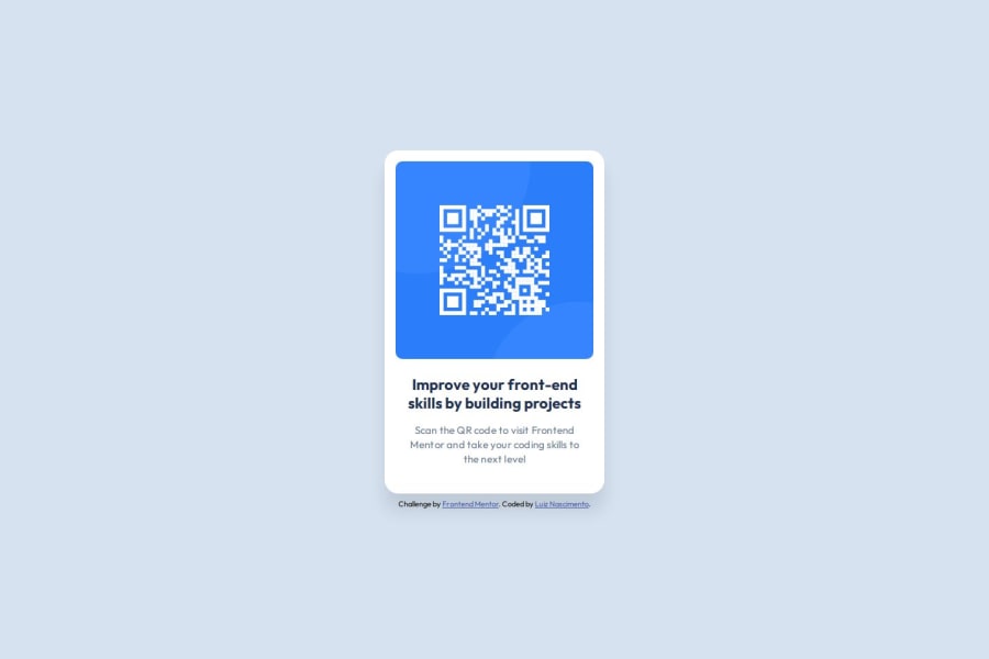
Design comparison
SolutionDesign
Community feedback
- @MENTORMICHAELPosted 6 months ago
Maybe it appears like that because I used my phone to design it but my design has two pages so check the desktop view it might appear to be normal.
0
Please log in to post a comment
Log in with GitHubJoin our Discord community
Join thousands of Frontend Mentor community members taking the challenges, sharing resources, helping each other, and chatting about all things front-end!
Join our Discord
