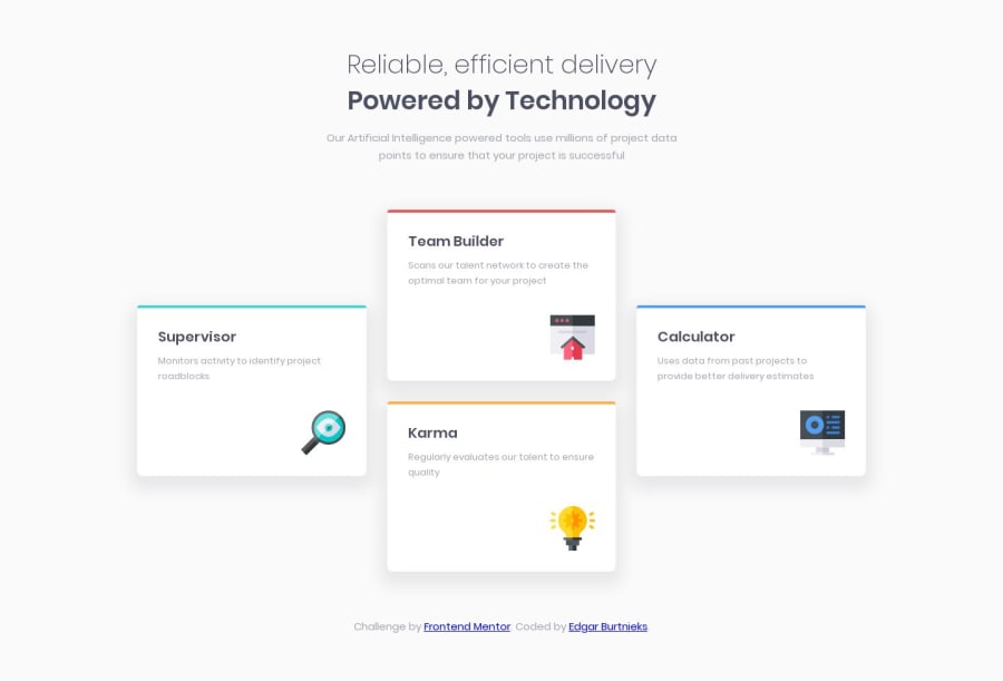
HTML and CSS mobile first four card feature section using CSS grid
Design comparison
Solution retrospective
Any feedback will be appreciated!
Community feedback
- @mattstuddertPosted over 4 years ago
Nice work on this challenge, Edgar! Your solution looks really good. The only major change I'd suggest in your HTML would be to use generic
divelements for each of the cards instead ofarticle. Article elements are typical used for self-contained content that can live independently from the rest of the content on the site. For example, blog posts, articles, and forum posts offer value in their own right and so are perfect candidates for thearticletag.I hope this makes sense. Let me know if you have any questions!
1@edburtnieks-privatePosted over 4 years agoThank you for the feedback! I am still guessing and doubting the usage of article tags, but this made it a little bit clearer.
0@mattstuddertPosted over 4 years ago@edburtnieks you're welcome! It can definitely be tricky to understand the nuances of the different HTML5 structural elements. Glad that's cleared it up a little bit!
0
Please log in to post a comment
Log in with GitHubJoin our Discord community
Join thousands of Frontend Mentor community members taking the challenges, sharing resources, helping each other, and chatting about all things front-end!
Join our Discord
