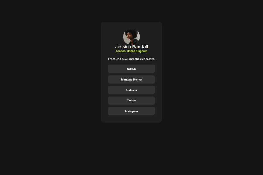
Design comparison
SolutionDesign
Solution retrospective
any suggestion?
Community feedback
- @Farshadr12Posted 9 months ago
Hi there , well done on your design. I have a few suggestions that you might improve the design. you can use margin bottom on the H1 element and the avatar. so it would make it more similar to the main design. It is a good idea to have different classes for different elements to organise them better in your project however in small ones you may want to use child combinator for selecting specific children of an elements for more speed. Overall great job
0
Please log in to post a comment
Log in with GitHubJoin our Discord community
Join thousands of Frontend Mentor community members taking the challenges, sharing resources, helping each other, and chatting about all things front-end!
Join our Discord
