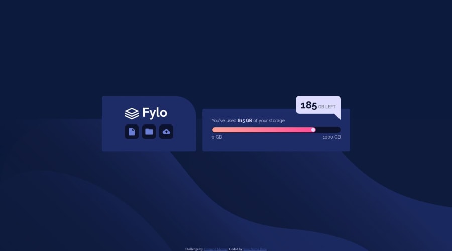
Design comparison
SolutionDesign
Solution retrospective
Any suggestions?
Community feedback
- @rfilenkoPosted over 4 years ago
Hi Olexandra, good job, few tips to improve your code:
- set box-sizing: border-box; on html or body;
- buttons should be links or buttons;
- use classes for styling;
Keep coding 😉 Roman
1@Karska-devPosted over 4 years ago@rfilenko Thank you! It's very helpful! Could you please tell more about "use classes for styling"? Almost everything on the page is unique, except buttons, so what is the point to use classes?
0@rfilenkoPosted over 4 years ago@Karska-dev hey, it's a modern approach with selectors specificity in core and css maintenance. As project grows, it's easy to structure and overwrite styles. popular solutions like bootstrap or tailwind use this utility class approach. Also you can check BEM naming convention 🙂
1
Please log in to post a comment
Log in with GitHubJoin our Discord community
Join thousands of Frontend Mentor community members taking the challenges, sharing resources, helping each other, and chatting about all things front-end!
Join our Discord
