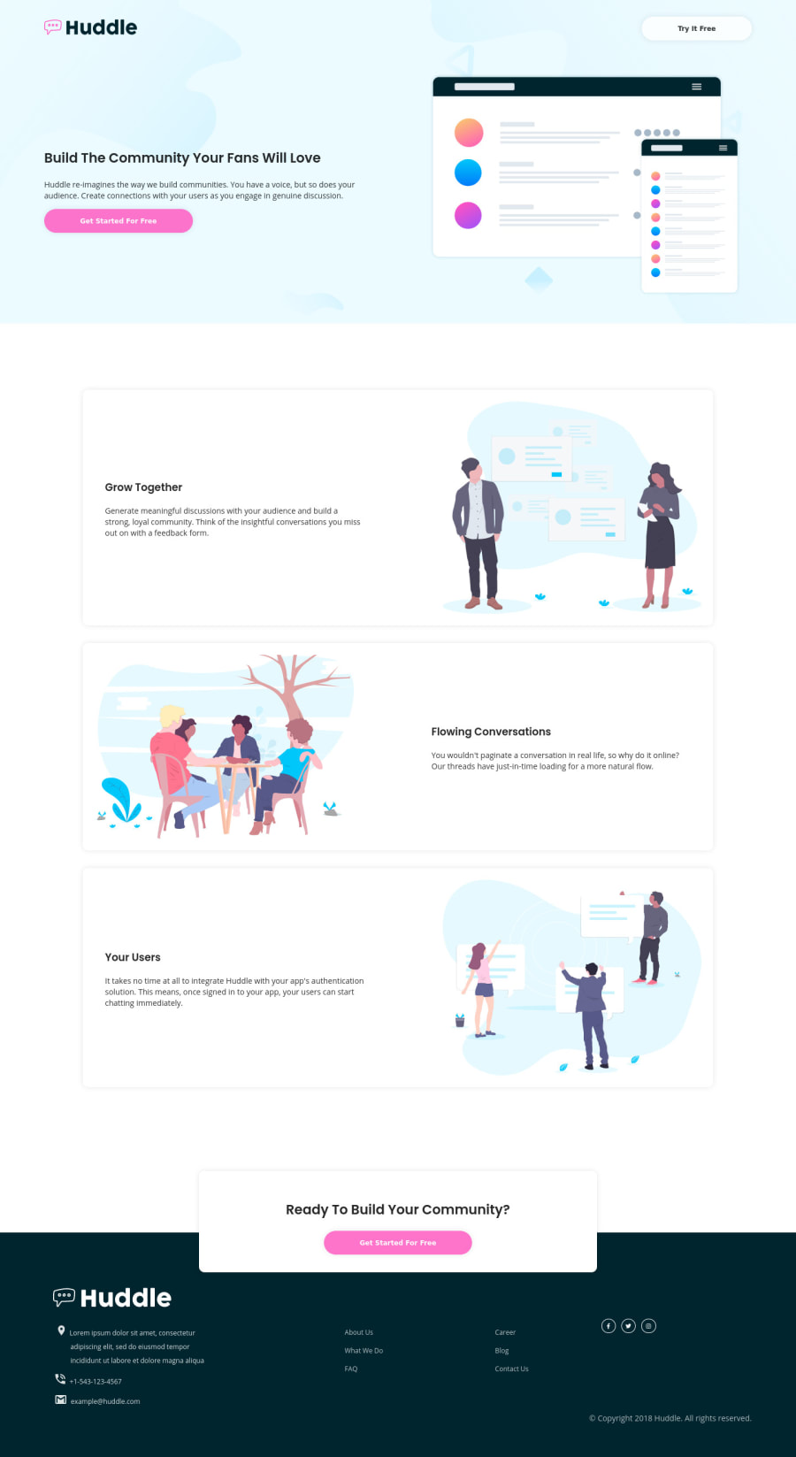
Design comparison
Solution retrospective
any feedback for me guys.. if there's a problem in my code or output. And Any improvement for me I'm gonna happy to know that . T.Y.
Community feedback
- @pikapikamartPosted over 3 years ago
Hey, great work on this one. The desktop view is fine thought some appears small, the mobile view is fine but resizing the browser, a lot of issues especially element responsiveness.
Some suggestions would be that:
-
Do not remove the
outline
property on the interactive elements likebutton
. This helps users who uses keyboard, to know where they are when they are navigating on your website. If you remove this, remember to add a:focus
selector on those and adding some custom properties likeborder
orbox-shadow
, an indicator for the user. -
The images does not really need to have that transition effect. They are just for decoration and they are not really interactive so it is not really suited for them to have that effects.
-
Font-sizes needs to be adjusted, right now, some are smaller than what it needs to be. Adjusting them will be awesome.
-
Social media icons needs to be wrapped inside
a
tags, since they are links, they need to be insidea
tags.
Resizing Issues:
-
Going down until your mobile breakpoint. The images are changing and they are too small for the layout. The text get's very narrowed, the buttons are wrapping the text inside them and your footer text goes in different directions.
-
You can address this via making sure everything scales or creating another breakpoint in which you will create a layout for it. That way, the elements does not really needs to be shifted very small until the mobile breakpoint is reached.
But still, good job on this one^
1@Dnghckr16Posted over 3 years ago@pikamart how do i fix when resizing my browser until the breakpoints of mobile view? should i use media queries for every screen view like tablet size?.
0@pikapikamartPosted over 3 years ago@Dnghckr16 Hey, well that is another option right.
Making a breakpoint like at 1000px going down, if you are desktop first. Then perhaps adjusting first the overall padding of the
container
so that the elements have more width, but it will just a little. Also, if you somehow can use aclamp
function on your image, then this will be great since you can specify its min and max dimension. Also adjust thegap
of every card since it is too big, you start at80px
, maybe lowering it down, since you can justjustify-content: space-between
to spaced out the left and right content of the flex.Then at point 700px, you can just use the mobile layout on this one
0 -
- @Dnghckr16Posted over 3 years ago
sorry I use 1280 screen laptop view for this challenge
1@palgrammingPosted over 3 years ago@Dnghckr16 do not be sorry it looks good big and small 🌟🌟🌟🌟🌟 good job
0
Please log in to post a comment
Log in with GitHubJoin our Discord community
Join thousands of Frontend Mentor community members taking the challenges, sharing resources, helping each other, and chatting about all things front-end!
Join our Discord