Design comparison
Solution retrospective
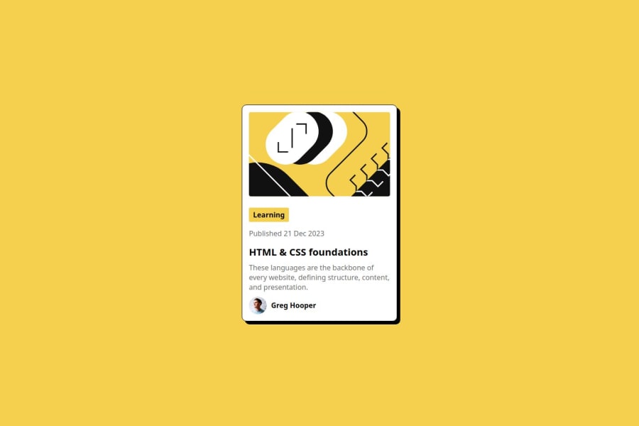
I am most proud of the clean and modern design I created for the card, which effectively showcases the content with an engaging layout. Next time, I would focus on optimizing the responsiveness further to ensure a seamless experience across all devices.
What challenges did you encounter, and how did you overcome them?I faced challenges with font integration and ensuring consistent styling across different browsers. To overcome these, I meticulously verified file paths and used @font-face for custom fonts, while testing the design in multiple browsers to ensure compatibility.
What specific areas of your project would you like help with?I would appreciate help with enhancing the responsiveness of the card design to ensure it adapts well on various screen sizes. Additionally, guidance on optimizing the loading speed for images and fonts would be beneficial.
Join our Discord community
Join thousands of Frontend Mentor community members taking the challenges, sharing resources, helping each other, and chatting about all things front-end!
Join our Discord
