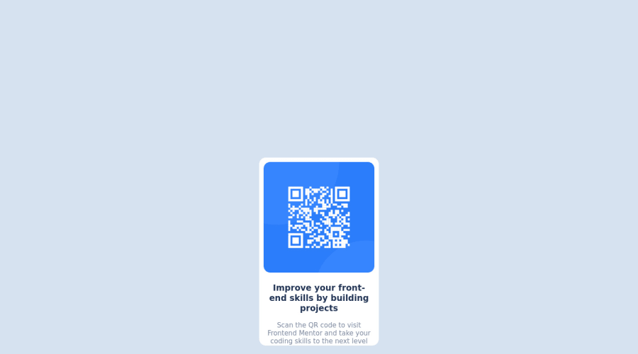
Design comparison
Solution retrospective
I have a very basic understanding of HTML and CSS and struggle with positioning of elements. I don't think i've positioned the QR Card correctly as I have not used flex anywhere as i'm not familiar with it.
For layout I used multiple Div's to stack the QR code on top of the text sections. Again, not sure if this is the correct approach.
I also did not understand the widths that the designs were created with (i.e. mobile: 375px and Desktop: 1440px). Can someone explain to me how I should use this information
updated solution
After some very helpful feedback on my first attempt I have updated the code to use flexbox in order to centre the QR Card. I also added in the footer.
Community feedback
- Account deleted
Hi Shamir! 👋 Congrats on submitting the challenge!
DIVs are just fine, you did right there!
Since you are not familiar with flexbox I will add the code here which you can copy and add to your CSS. Add this declaration block to your
body
selector and the card will be centered.height: 100vh; display: flex; align-items: center; justify-content: center;
Also, the width of the card should be 325px.
Regarding the mobile and desktop widths provided - that's just the width of the screenshots you were given as a design. Use that for orientation, you don't need to put those values anywhere in your code.
I hope this helps. Keep up! 👨💻💪
Marked as helpful0@SochmootPosted over 2 years ago@kom42ec thanks for your comment! I will try out your code and check the results. Many thanks for your feedback!
0 - @correlucasPosted over 2 years ago
The width 1440px and 375px are given to have a standard between the designs/solutions. If you use Google Chrome or Firefox you can use DevTools pressing f12 and set the exactly screen size, this way you know how much your solution match with the Figma design.
I advise you to use flexbox because is really more simple, for example to center the card the only thing you need to do is put all your content inside a div and set the body the following code.
body { display: flex; align-items: center; justify-content: center; }
To understand better and see how easy is flexbox, you can try this mini-game that explain you how the flexbox properties work:
https://flexboxfroggy.com/
I hope it help you!
Marked as helpful0@SochmootPosted over 2 years ago@correlucas Thanks so much for your comment! and thank youfor the flexbox link, i will definitely try this!
0
Please log in to post a comment
Log in with GitHubJoin our Discord community
Join thousands of Frontend Mentor community members taking the challenges, sharing resources, helping each other, and chatting about all things front-end!
Join our Discord