Design comparison
Community feedback
- @hana-chongPosted over 1 year ago
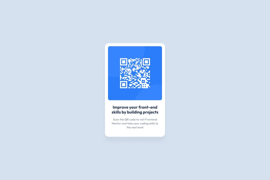
Hey Seth! The proportions within the container are looking great. The laptop view however isn't working very well- it's too large and the top portion isn't visible. I think this could be fixed pretty easily though by adding some additional size formatting to '.card'. It fits much better on mobile view and would look even cleaner with some side margins added. The QR image is centered perfectly on the top and sides of the card on all screen views- great job!!!
Marked as helpful1@KingSkyrosPosted over 1 year ago@hana-chong yah ❓, You can make the thing smaller or just make it responsive to all screens
0@sukaloafPosted over 1 year ago@hana-chong I changed some of the css so it would scale better. Thank you for pointing that out!
0
Please log in to post a comment
Log in with GitHubJoin our Discord community
Join thousands of Frontend Mentor community members taking the challenges, sharing resources, helping each other, and chatting about all things front-end!
Join our Discord
