HTML & CSS, Google Fonts, CSS Pseudo Elements, CSS Object-Fit
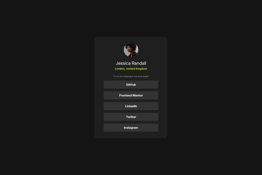
Design comparison
Solution retrospective
Next time, I would explore adding subtle animations or transitions to enhance the interactivity and overall user experience of the card.
What challenges did you encounter, and how did you overcome them?The task wasn't very difficult, so I didn't encounter any major challenges.
What specific areas of your project would you like help with?I would appreciate feedback on the overall responsiveness of the card design, particularly how it adapts to different screen sizes. Additionally, I would like input on the typography choices and spacing to ensure optimal readability and visual appeal. Any suggestions for enhancing the interactivity through animations or transitions would also be valuable.
Community feedback
- @MikDra1Posted about 1 month ago
Well done, here are some things to review 😊:
-
Overusing div tags: Try using more semantic HTML elements like
<section>
,<header>
, and<article>
. It’ll help with both accessibility and SEO. -
Neglecting responsive design: Make sure you're using media queries and following a mobile-first approach so your site looks great on all devices.
-
Inconsistent class naming: It’s easy to end up with a mess of class names. Consider using a system like BEM for better organization and scalability.
-
Using px for everything: Instead of
px
for fonts and layouts, try using relative units likerem
orem
to make your design more adaptable to different screen sizes. -
Forgetting alt text on images: Don’t skip the
alt
attribute. It’s essential for accessibility and helps search engines understand what your images are. -
Poor use of Flexbox and Grid: Be careful not to mix Flexbox and Grid unnecessarily. Each has its strengths—use the right one based on the layout needs.
-
Not testing across browsers: Don’t forget to check how your site looks in different browsers like Firefox and Safari. Cross-browser testing is super important.
-
Ignoring accessibility: Focus on features like keyboard navigation, contrast ratios, and ARIA labels. They make your site usable for more people.
-
Using fixed heights for elements: Setting fixed heights can cause overflow issues. Use
min-height
or allow content to expand naturally to avoid problems.
Hope you found this comment helpful 💗💗💗
Good job and keep going 😁😊😉
0 -
Please log in to post a comment
Log in with GitHubJoin our Discord community
Join thousands of Frontend Mentor community members taking the challenges, sharing resources, helping each other, and chatting about all things front-end!
Join our Discord