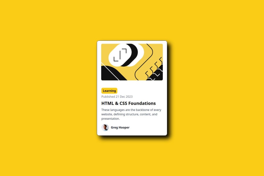
Design comparison
SolutionDesign
Solution retrospective
What are you most proud of, and what would you do differently next time?
i will add font style next time.
What challenges did you encounter, and how did you overcome them?font styling
Community feedback
- @tatasadiPosted 3 months ago
Congratulations on completing the challenge! Your solution looks great, and you've done a fantastic job. I have two small suggestions to make it match the design even more closely:
- For the card, consider using this box-shadow:
8px 8px 0 0 black. This will give it a bit more depth and stay true to the design. - You could adjust the paragraph color to a darker gray or black with
opacity: 0.5to align better with the design's intended contrast.
Great work overall! Keep it up!
Marked as helpful1 - For the card, consider using this box-shadow:
- @nowshadjaman21Posted 3 months ago
Thank you for you advice. I will surely follow as you said.
0
Please log in to post a comment
Log in with GitHubJoin our Discord community
Join thousands of Frontend Mentor community members taking the challenges, sharing resources, helping each other, and chatting about all things front-end!
Join our Discord
