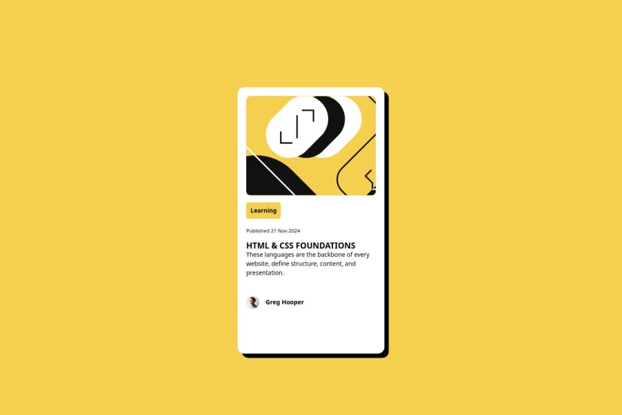
Design comparison
Community feedback
- P@stuartbradleyPosted 4 months ago
Your html is well commented. You could however work on your structuring and formatting of your code. There are a couple of instances where there are line breaks between tags that don't need to be there and hinder readability.
Its good you are including media queries, however they dont seem to work as intended. Using browser tools, I changed the width of the page and the card outline stays intact. However the text and images fall out of line of the card and it becomes skewed.
Marked as helpful0@GentlefrankPosted 4 months ago@stuartbradley I appreciate your observation. Please check out my new task. https://www.frontendmentor.io/solutions/recipe-page-task-tiUgrjB0IZ
0 - @AdrianoEscarabotePosted 4 months ago
Hi Gentlefrank, how are you doing? I really loved the outcome of your project, but I have a few suggestions that I think might be helpful:
You have used <br> , using <br> is not only bad practice, it is problematic for people who navigate with the aid of screen reading technology. Screen readers may announce the presence of the element. This can be a confusing and frustrating experience for the person using the screen reader.
The rest is excellent.
I hope you find it useful. 👍
0@GentlefrankPosted 4 months ago@AdrianoEscarabote I appreciate your suggestion. I'll work more on spacing web content with line-spacing and padding. Much thanks for drawing my attention to this detail.
1@GentlefrankPosted 4 months ago@AdrianoEscarabote I have put implemented your corrections in a new task. Please check it out in the link below. https://www.frontendmentor.io/solutions/recipe-page-task-tiUgrjB0IZ
1
Please log in to post a comment
Log in with GitHubJoin our Discord community
Join thousands of Frontend Mentor community members taking the challenges, sharing resources, helping each other, and chatting about all things front-end!
Join our Discord
