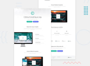
Design comparison
Solution retrospective
I was really had problem with the adjusting the width of the paragraph. But tried bit hard to fix it. Any kind of feedbacks will be appreciated.......
Community feedback
- @MojtabaMosaviPosted over 3 years ago
@Syed-Ansar you've done good job on this one, looks nice and responds well. There are a few sublte things that would make your solution look even better.
-
Add a hover state to your button, links and social icons in the footer, it takes no to do it and makes you solution much more interactive.
-
Your social icons need to be wrapped in a <a> tag sine they must be clickable.
-
From around 800px to 1000px the buttons in the header are tied togather, looks a bit off, add margin to one of them throught modifier.
-
On desktop view the image in computer section is not positioned as specified in the design, it looks ok but I suggest you play around with margin or relative positioning to get it in right place.
-
In you markup you need to improve the way name things, for the most part you a good job but in some places you use names like class="1", I suggest you spend some time learning about BEM.
Happy Coding :)
0@Syed-AnsarPosted over 3 years ago@MojtabaMosavi I will look at it. Thank you for your comments Mojtaba.!
0 -
Please log in to post a comment
Log in with GitHubJoin our Discord community
Join thousands of Frontend Mentor community members taking the challenges, sharing resources, helping each other, and chatting about all things front-end!
Join our Discord
