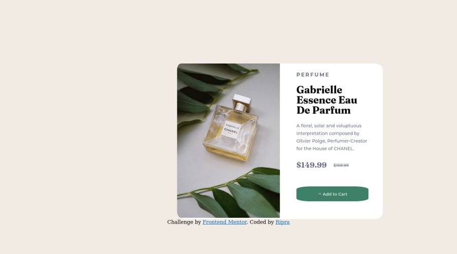
Design comparison
Solution retrospective
First project, still much to learn, i had some problems with button border radius, i used an input tipe button to do it but i did'nt get a completely round border
Community feedback
- @AdrianoEscarabotePosted over 2 years ago
Hi Ric, how are you? Welcome to the front-end mentor community! I really liked the result of your project, but I have some tips that I think you will enjoy:
images must have alt text unless it is a decorative image, for any decorative image each IMG tag must have empty
alt=""and addaria-hidden="true"attributes to make all the assistive technologies of the Web, as screen reader. Learn the differences between decorative/meaningless images vs important content.Document should have one main landmark, this problem is being caused by the fact that there is no main tag around the main content of the page! Since this challenge is based on only one component, there is no other component more important than it on this page, so to solve this, wrap all the content with the
maintag,It's always good to pay attention to the correct use of semantic html elements, as they are extremely important for people who use screen readers, to know what the main content of the page is in the case of the
maintag!To align some content in the center of the screen, always prefer to use
display: flex;it will make the layout more responsive!body { margin: 0; padding: 0; display: flex; align-items: center; flex-direction: column; justify-content: center; min-height: 100vh; }The rest is great!
I hope it helps... 👍
Marked as helpful1 - @Ripra87Posted over 2 years ago
@AdrianoEscarabote It really helps Adriano thank you so much! Till now i only studied the main display, block, inline and inline-block. I now read something on w3schools about the flex display and it looks like to be perfect! I'll try to recode the challenge using your tips, thank you again! About the alt in the image i forgot it :P And for the main tag, i knew it just i didn't put so much attention on it concentrating to the css code, but you're right i have to take the habit to code the HTML in the correct way in any situation! aria-hidden="true" --> this atribute is new for me, i still never see it, i'll check around for it to understand in better )
0
Please log in to post a comment
Log in with GitHubJoin our Discord community
Join thousands of Frontend Mentor community members taking the challenges, sharing resources, helping each other, and chatting about all things front-end!
Join our Discord
