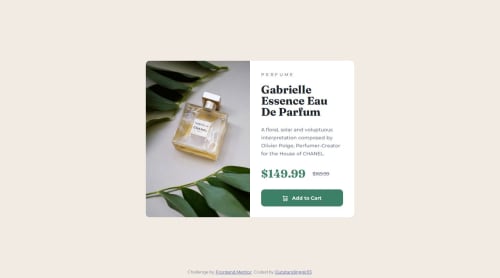
HTML & CSS: Creating a Responsive Card Component

Solution retrospective
I'm proud of several achievements from this project. First, I significantly improved my skills with Git and GitHub, discovering and using many new commands I hadn't encountered before. I also deepened my understanding of element positioning, learning about the differences between fixed and static positions. My knowledge of the box model, margins, and padding has become much stronger. Finally, this project increased my awareness of how user experience can vary across different devices and taught me how to create more responsive webpages.
What challenges did you encounter, and how did you overcome them?Here is a list of the challenges I've encountered so far while working on this project:
- Positioning the element in the center of the screen.
- Finding a way to make the element with the class .attribution, acting as a footer, stick to the bottom of the page and remain visible.
- Dividing the into two parts: one for the product image and one for the product description.
- Switching to more responsive units.
- Fixing the footer on mobile devices.
Detailed descriptions of how I addressed these challenges can be found in the README.md file.
What specific areas of your project would you like help with?I welcome any suggestions for improving code readability and for finding smarter solutions to the challenges I've outlined above. 🙂
Please log in to post a comment
Log in with GitHubCommunity feedback
No feedback yet. Be the first to give feedback on Outstandinggirl13's solution.
Join our Discord community
Join thousands of Frontend Mentor community members taking the challenges, sharing resources, helping each other, and chatting about all things front-end!
Join our Discord