Design comparison
Solution retrospective
Hope you could give me feedback. Thanks!
Community feedback
- @brodiewebdtPosted almost 3 years ago
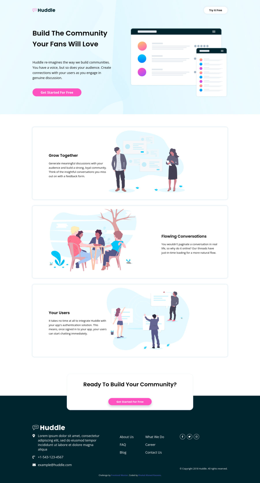
This looks good. The only thing I would suggest is to lower the line-height of the H1 tag to about 1.2. There is too much space there now. Use more line-height for smaller text and less for Heading and larger size text. The layout looks very good.
To clear the accessibility warnings: Wrap your code from the end of the header to the start of the footer in a Main tag. You want all of your main content wrapped in a main tag. Add aria-labels to the footer links with the social icons. IE: aria-label="Facebook link". That will clear the warnings. Download AXE DevTools and you can clear the warning while you are coding. https://www.deque.com/axe/devtools/
Hope this helps.
Marked as helpful0@KhaledAhmedKassemPosted almost 3 years ago@brodiewebdt Thanks for your feedback
0
Please log in to post a comment
Log in with GitHubJoin our Discord community
Join thousands of Frontend Mentor community members taking the challenges, sharing resources, helping each other, and chatting about all things front-end!
Join our Discord
