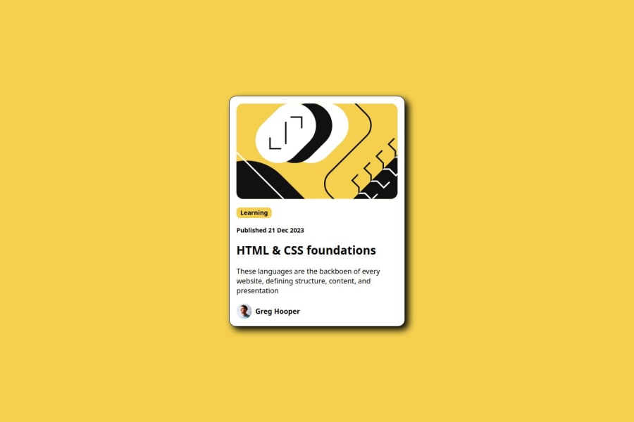
Design comparison
Solution retrospective
I am very happy with my ability to eye the proportions of the design.
What challenges did you encounter, and how did you overcome them?I was having problems deciding what was the best element for each item of the design. To overcome this I focused on the hierachy of the design. (h1, h2 etc.)
What specific areas of your project would you like help with?I really am having trouble organising my HTML and CSS code. I always feel like it looks messy.
Community feedback
- @maike-kramerPosted 4 months ago
Looks good. The box shadow is different and also the color of the description. The code looks also good.
0 - @zhammersteinPosted 4 months ago
looks good. the original doesnt have that type of box shadow though.
0
Please log in to post a comment
Log in with GitHubJoin our Discord community
Join thousands of Frontend Mentor community members taking the challenges, sharing resources, helping each other, and chatting about all things front-end!
Join our Discord
