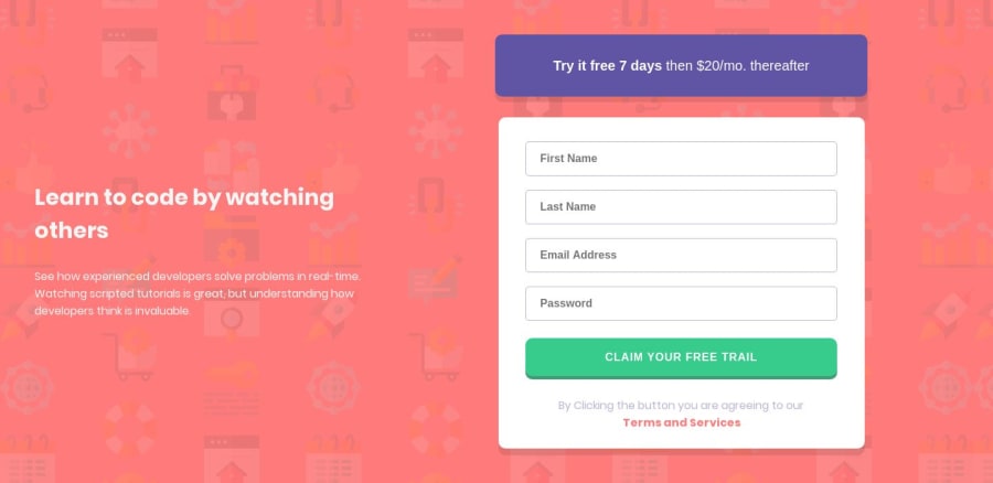
Design comparison
Solution retrospective
All comments are welcome
Community feedback
- @simeon4realPosted almost 5 years ago
Hey Wayne, I just previewed your solution and It's on point. However, I have a couple of recommendations.
-
Reduce the font size on smaller screen sizes. You can accomplish this using Media Queries.
-
Don't use IDs for styling your websites. Javascript uses ID and you can't apply an ID more than once. Instead, I suggest you make use of classes. Instead of
#submit {
	styles here
}
You can use
.submit { styles here }-
Embrace Cleaner Codes. Learn how to use the BEM methodology and learn about HTML5 Semantic markups.
-
To fix those accessibility issues, you should wrap each of your input with a
<label></label>element.
Then you can add **aria-label="description of input" ** to your inputs.
You can upvote my feedback if you found my recommendations useful.
1 -
- @rafaelmaiachPosted almost 5 years ago
Hey Wayne, congratulations on your solution! Clean and well done.
About some feedback:
- The report identified some accessibility problems. You could check and fix them as accessibility on the web is growing every day.
Comparing the solution with the challenge, it seems some font-sizes and elements spacing (padding / margin) are different.
- On the left text, you could put it more to the right and increase the title font size.
- The purple button seems to be bigger too
Also, your buttons don't have a cursor: pointer set. This makes bad feedback to user when hovering them.
1
Please log in to post a comment
Log in with GitHubJoin our Discord community
Join thousands of Frontend Mentor community members taking the challenges, sharing resources, helping each other, and chatting about all things front-end!
Join our Discord
