Design comparison
SolutionDesign
Solution retrospective
thank you for your feedback
Community feedback
- @martam90Posted almost 4 years ago
Hi,
Nice work. Here are my suggestions:
check your report - there are HTML issues with section and using headings.
I think buttons in main should have bolder text when you hover on them.
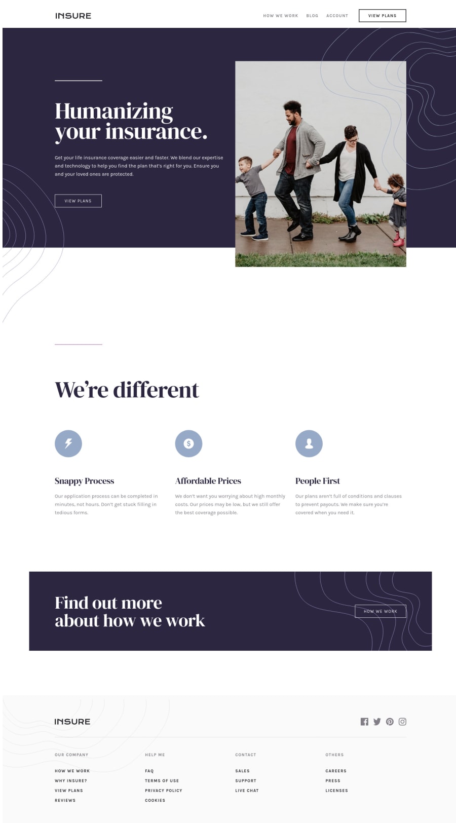
Set margin: 0 to body. You will remove that white space on the left side of the main.
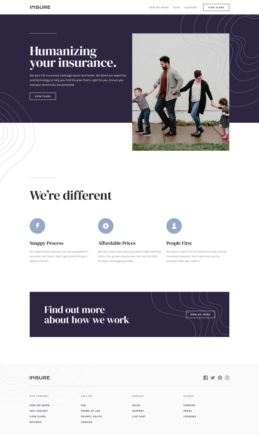
In mobile menu version menu-items should have lighter color. Check it with design.
I would think how to improve intro-mobile-image. It doesnt look good for on devices that have 425 px (the image is in the center and on its left and right are blank spaces).
I hope this might be helpful :)
0
Please log in to post a comment
Log in with GitHubJoin our Discord community
Join thousands of Frontend Mentor community members taking the challenges, sharing resources, helping each other, and chatting about all things front-end!
Join our Discord
