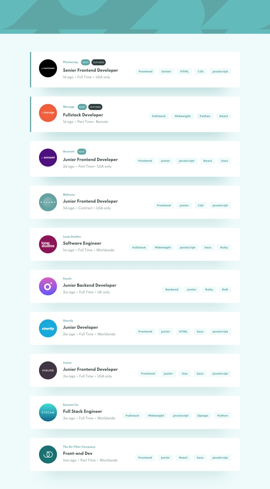
Design comparison
SolutionDesign
Solution retrospective
would love some feedback, especially on the javascript functionality
Community feedback
- @ChamuMutezvaPosted over 3 years ago
Well done, you got the functionalities working perfectly.
- you are missing the clear button
- the display for the filter at about 375px is a bit small , you need to make adjustments when the display is being populated to accommodate more elements with no or little distortions
1@Anwar11234Posted over 3 years ago@ChamuMutezva Thanks a lot, gonna work on these adjustments and the clear button
0
Please log in to post a comment
Log in with GitHubJoin our Discord community
Join thousands of Frontend Mentor community members taking the challenges, sharing resources, helping each other, and chatting about all things front-end!
Join our Discord
