Design comparison
Solution retrospective
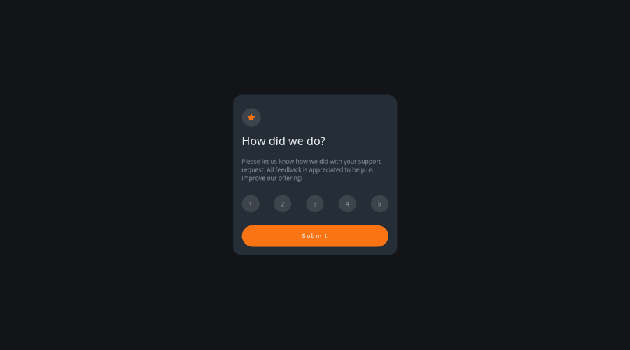
Hello everyone!! All the feedbacks are welcomed. Here is my solution for the this challenge. But I don't know if the method I have used is the right way. Can someone take a look at my code and tell If Its the right way? Thank You..
Community feedback
- @FluffyKasPosted almost 3 years ago
Hey,
Your solution looks really good! As to the functionality, you'd have an easier time with a more semantic markup. I suggest using checkbox inputs, not paragraphs. Bit harder to style I guess, but it would be the logical choice for this challenge and it's easier to handle with Javascript.
Alternatively, if you don't want to change that much, you could just swap the paragraphs with buttons, that's still a slightly more semantic solution.
The submit button's font-family is the browser's default font at the moment, so don't forget to overwrite that ( and make it uppercase).
Apart from this, I think you did great here. Happy coding ^^
0
Please log in to post a comment
Log in with GitHubJoin our Discord community
Join thousands of Frontend Mentor community members taking the challenges, sharing resources, helping each other, and chatting about all things front-end!
Join our Discord
