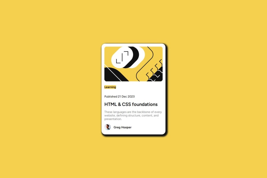


Design comparison

Solution retrospective
It took me hours to complete this project. I've been off coding and design for months. Just getting back into design with this project. Kindly help review and provide constructive feedback that will be of great help to me. Getting the box-shadow right aint easy. Not sure if I got it correctly as pointed out in the design. Your feedback is of utmost priority. Thanks
Community feedback
- @danielmrz-devPosted 10 months ago
Hello @Homorkhay!
Your project looks great!
I noticed that you used
positionto place the card in the middle of the page. It's a good method but in some cases can cause bugs and cut off part of your content on smaller screens.Here's another very efficient way to center the card:
- Apply this to the body (in order to work properly, don't use position or margins):
body {
    min-height: 100vh;
    display: flex;
    justify-content: center;
    align-items: center;
}
I hope it helps!
Other than that, great job!
Marked as helpful0@HomorkhayPosted 10 months ago@danielmrz-dev
Thank you for the great feedback, sir. Yeah absolutely that's right, I've been using Flexbox in my previous project so I decided to try centering with the position. I will make the necessary changes, thank you once again for the back but then can you just briefly tell me when to use exactly this min-height, max-height, max-width and min-width or any article that will be helpful kindly help pls.
1@danielmrz-devPosted 10 months ago@Homorkhay
Here's a quick guide on height for the body:
In CSS,
height: 100vhandheight: 100%represent different concepts and have different behaviors.height: 100vh:This sets the height of an element to 100% of the viewport height. The viewport height is the full height of the user's browser window, regardless of the actual content height. Using100vhensures that the element takes up the entire height of the viewport.
This is often used for creating full-height sections or containers that cover the entire screen, for example, in a hero section or a landing page.
height: 100%:This sets the height of an element to 100% of the height of its containing element. It's a relative unit and depends on the height of the parent container.
In summary:
height: 100vhsets the height relative to the viewport height.height: 100%sets the height relative to the height of the containing element.Most projects here we use
min-height: 100vh;because they normally ocuppy the window's full height.I hope it helps!
Marked as helpful0@HomorkhayPosted 10 months ago@danielmrz-dev
Awesome. Thanks for this sir! Interesting so this apply for width as well (vw & %)
0

Please log in to post a comment
Log in with GitHub
Join our Discord community
Join thousands of Frontend Mentor community members taking the challenges, sharing resources, helping each other, and chatting about all things front-end!
Join our Discord