

Design comparison

Solution retrospective
I'm learning now so some centering and display attributes are still challenging.
What challenges did you encounter, and how did you overcome them?Display Attributes and centralization. Searching about this on google and trying again and again.
Community feedback
- @ttvclvckPWNERSPosted 8 months ago
Semantic HTML:
The use of semantic HTML in your solution is strong. You've appropriately used tags like<header>,<main>, and<footer>, which not only improve accessibility but also make the code more readable. However, ensure that all elements within these tags are also semantically appropriate (e.g., using<h1>for the main heading).Accessibility:
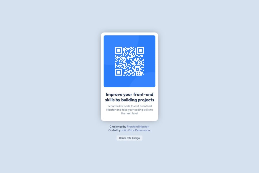
Your solution is generally accessible, but there are a few areas where improvements could be made:- Ensure that images, including the QR code, have
altattributes that describe their content. This helps screen readers convey the purpose of the image to users with visual impairments. - Consider adding
aria-labelsoraria-described byfor interactive elements to provide additional context for assistive technologies. - Verify color contrast ratios to make sure the text is legible for users with visual impairments.
Responsive Layout:
The layout looks good across a range of screen sizes. The content scales well, and the QR code remains easily accessible on smaller screens. One suggestion is to test the layout on very small screen widths to ensure no elements are too cramped or overlapping.Code Structure and Readability:
Your code is well-structured and easy to read. You’ve done a great job of keeping it organized and using descriptive class names. To improve reusability:- Consider modularizing your CSS by using more classes and fewer IDs, as classes can be reused across different components.
- Group related CSS properties together and remove any redundant styles to streamline the code.
Design Consistency:
Your solution closely follows the design, which is great. There are no significant deviations that would detract from the user experience. However, always check the finer details, like padding, margins, and font sizes, to ensure they match the design specifications exactly.Marked as helpful1@joaoggpPosted 8 months ago@ttvclvckPWNERS Thanks for the comment, I'll take those notes and delve deeper into what you highlighted!
In terms of fidelity to the example, I decided to add the footer with the credits and added some hover styles to improve interaction, I'm still delving deeper and your notes are of great value, thank you!
Note: I added the example to my profile without credits and I really noticed a small difference in the texts.
0 - Ensure that images, including the QR code, have

Please log in to post a comment
Log in with GitHubJoin our Discord community
Join thousands of Frontend Mentor community members taking the challenges, sharing resources, helping each other, and chatting about all things front-end!
Join our Discord