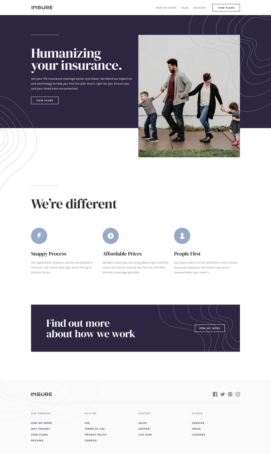
Design comparison
SolutionDesign
Solution retrospective
- I didn't figure out how to add the squigly graphics. Any tips on how to position them correctly?
- I didn't do the mobile designs. Are these supposed to be a separate file, or just a responsive addition to the same file?
Community feedback
- @lailton-bPosted almost 5 years ago
If you want to take a look at my resolution to this challenge with google developer tools. I recommend that you do this in other resolutions whenever you don't know how to do something.
0 - @lailton-bPosted almost 5 years ago
- You can add the images by placing position: relative in the parent element and positioning the images with position: absolute.
- Just a responsive addition.
0@jakesingPosted almost 5 years agoAwesome, thanks! I was able to figure it out :) But of course then I couldn't get the z-index piece to work properly...
0
Please log in to post a comment
Log in with GitHubJoin our Discord community
Join thousands of Frontend Mentor community members taking the challenges, sharing resources, helping each other, and chatting about all things front-end!
Join our Discord
