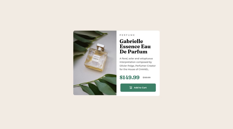


Design comparison

Solution retrospective
I couldn't find a way to make the images fit the container completely. If anyone has done this project and can please give an insight into how they solved this, it'll be appreciated.
Community feedback
- @W4GFOPosted over 2 years ago
Hello @BimboAdesoye,
First, it's a nice solution, but the image is sitting in a frame it isn't big enough for and therefore is becoming a bit off. You use the object-fit cover, but in the desktop size is still using the mobile assets even though you're using the picture tag.
Also, you may want to want to look at max-width and max-height to avoid letting your content extending or shrinking past a point where the image assets get skewed.
It does look like good work, just a bit of practice. Also, in reference to @starryrobot comment - it's an excellent point. Below is the first thing I do for every project. This is from a React project, but you can just put it into your body tag. FYI - I always make the background orange right off the bat just so I can see it's covering the entire screen.
Hope this help.
div#root { width: 100vw; height: 100vh;
display: flex;
align-items: center; justify-content: center;
background-color: orange; }
Marked as helpful0 - @starryrobotPosted over 2 years ago
This looks great! I notice from the live demo the mobile version isn't centered. I usually do this by adding this to the body tag;
min-height: 100vh;display: flex;justify-content: center;align-items: center;flex-direction: column;This will ensure the layout spans the full height of the viewport and then aligns everything centrally. Without this, the layout will start from the top of the page and then will stop after the content because there is no defined height set. When setting the body tag to the entirety of the viewport height, everything is spread out across the available space :)
Marked as helpful0


Please log in to post a comment
Log in with GitHub
Join our Discord community
Join thousands of Frontend Mentor community members taking the challenges, sharing resources, helping each other, and chatting about all things front-end!
Join our Discord