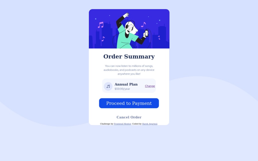
Design comparison
Solution retrospective
I have majorly used the POSITION attribute for positioning various text elements. Please tell whether it is the most correct way or I can use FLOAT or ALIGNMENT for positioning.
Community feedback
- @dusanlukic404Posted about 3 years ago
Hey Harsh, congrats on completing this challenge. I have some suggestions for you:
- You should use proper font-family.
- Make the card smaller and set the background size: contain on body background image.
- Your attribution should be outside the card.
- I suggest you to use flex or grid layout instead of positioning everything perfectly.
- It is not responsive so make sure to change it.
Marked as helpful0@harshag3036Posted about 3 years ago@dusanlukic404 Thanks, Dusan. I will keep in mind all the points.
0 - @Jawha3Posted about 3 years ago
Hello harshag3036, I was actually about to start this challenge myself. I think I will be using some CSS grid or flexbox to acheive the card layout. I am far from being an expert on the subject and cannot really comment on what is best practice in this scenario - that said, I do think you could have saved yourself a headache with the positioning had you used grid or flexbox.
0
Please log in to post a comment
Log in with GitHubJoin our Discord community
Join thousands of Frontend Mentor community members taking the challenges, sharing resources, helping each other, and chatting about all things front-end!
Join our Discord