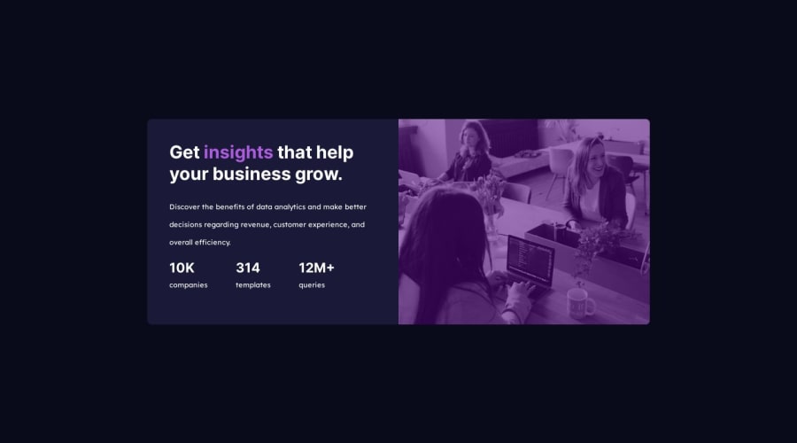


Design comparison

Solution retrospective
I found the background image is hard to change
Please your feedbacks guys 🔎 🖍🖋
Community feedback
- @adityaphasuPosted over 1 year ago
Hello, @AslamtoIbrahim!
Instead of using the background image with the linear gradient, you can just uncomment the
imgtag in your html.After this add an empty
divinside thesec2div and give it a class nameoverlayor anything you like then add the following CSS:.overlay { background: hsl(277, 64%, 61%); position: absolute; top: 0; height: 100%; width: 100%; mix-blend-mode: multiply; }- After adding the overlay, add
position: relativeto the.sec2div. - This will make an overlay and add that purple touch to the image.
Since we uncommented the image and now are using the image one for desktop and one for mobile we can make use of the picture element to make it switch at
max-width:768pxlike this:<picture> <source srcset="images/image-header-mobile.jpg" media="(max-width: 768px)" > <img src="images/image-header-desktop.jpg" alt="" > </picture>- Here inside the
<picture>element we usesourceto set the image we want to change at a specific screen size. srcset attribute is used to set the URL path whereasmediais used as a media query so as to when the image should change (in your case I'm using max-width since you have used desktop first workflow)- the
imgtag is usually used to set up the initial image and work as a normalimgtag. - So after using this initially your image will be the desktop one but as soon the width hits 780px the image will switch from desktop to mobile (the media query we specify in source according to that)
You can also remove all the CSS from the
.sec2div which are background related and now won't be needed.Good luck!
Marked as helpful0@AslamtoIbrahimPosted over 1 year agoHi, @adityaphasu Thank you so much for your valuable and helpful comment
1 - After adding the overlay, add

Please log in to post a comment
Log in with GitHub
Join our Discord community
Join thousands of Frontend Mentor community members taking the challenges, sharing resources, helping each other, and chatting about all things front-end!
Join our Discord