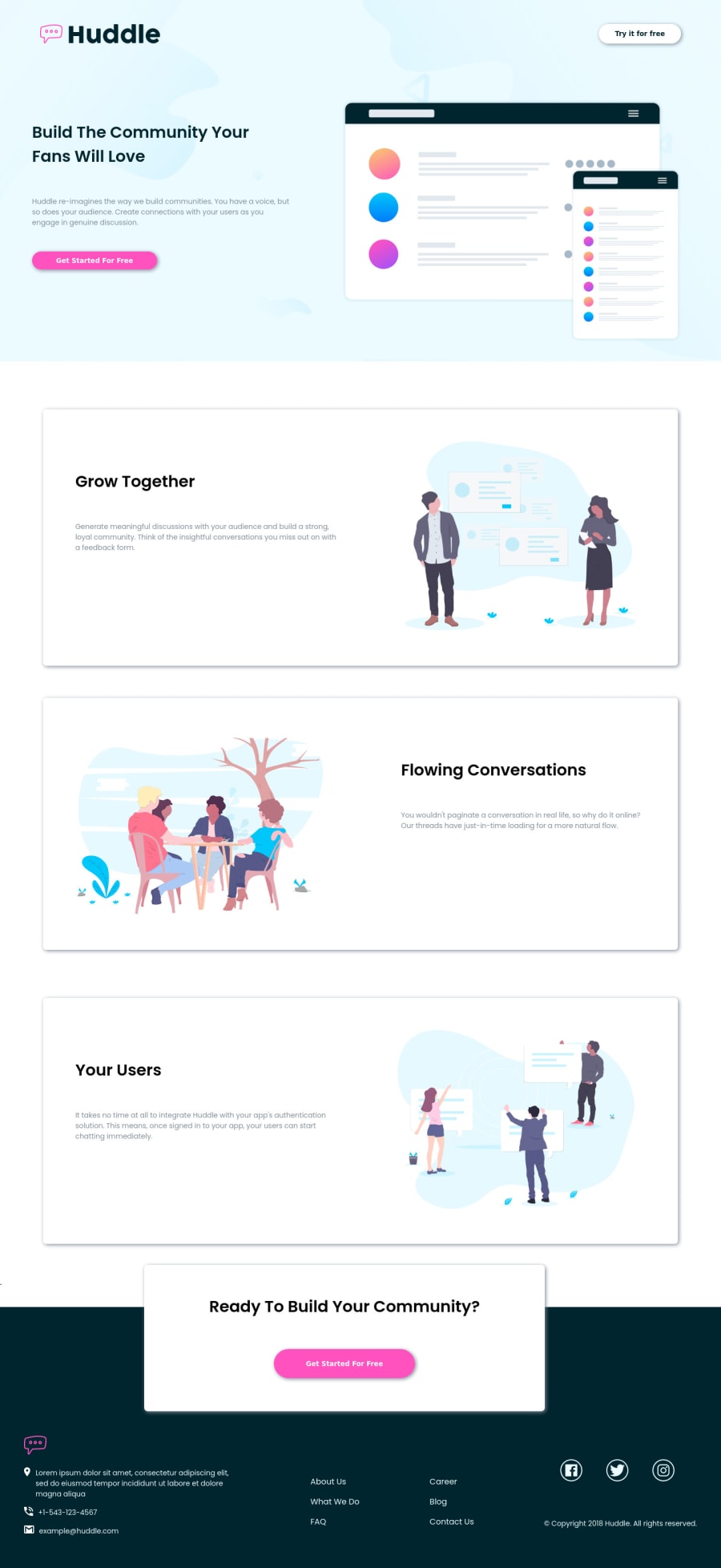
Design comparison
SolutionDesign
Solution retrospective
I have not used links in footer section i realized it only after creating the html.
I would like any feed back on footer section
Thankyou:-)
Community feedback
- Account deleted
I don't see anything wrong with the footer though it's advised to use anchor tags on a link.
- Give your whole site a maximum width of 1440px to stop it from stretching on big screens.
- The 'get started card' is not centered correctly so when you resize it doesn't stay in one place. Add this to the card,
.card{ margin-left: 50%; transform: translateX(-50%); }and it'll stay centered no matter what.
Marked as helpful1@sebzz2k2Posted about 3 years ago@thulanigamtee Thankyou so much. I forgot to ask in the faq ,but is there a way to change colour of the logo svg in the footer :-)
0Account deleted@sebzz2k2 Yes there is but it's quite complicated.
- You have to copy everything that's inside the given svg logo and use it to create another logo, then you can change the colors to get the ones you want.
It always works for me.
0
Please log in to post a comment
Log in with GitHubJoin our Discord community
Join thousands of Frontend Mentor community members taking the challenges, sharing resources, helping each other, and chatting about all things front-end!
Join our Discord
