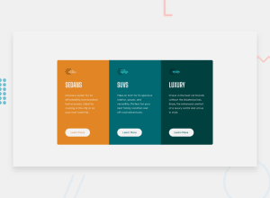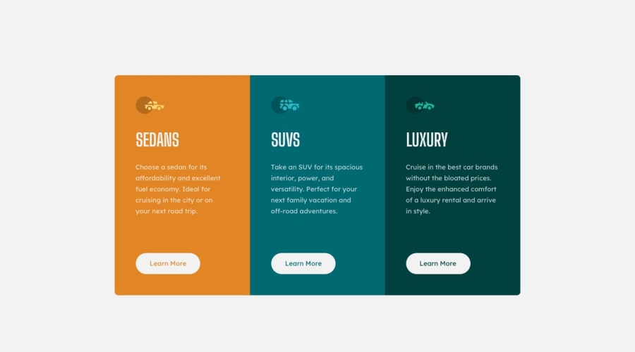
Design comparison
Community feedback
- @Mirjalol-bekPosted about 1 year ago
There are mistakes in the colors of writing, you should pay attention to them.
Marked as helpful0 - @gavharoyabdurahimovaPosted about 1 year ago
hozircha boladi,lekin borderlar bilan ishlash kk,hamda kengliklarda ham kamchilik bor
Marked as helpful0 - @qilichbek01Posted about 1 year ago
kamchiliklari bor buttonni borderiga border non berish kerak font-family ulanmagan;o'lchamlarida xatolik bor
Marked as helpful0 - @webdev57Posted about 1 year ago
This message is for @saddamjon1. Do not create fake accounts and write single line feedback to mark them as helpful in order to score more points. I have reported your account to the frontendmentor.io moderators. The same message applies to all the real/fake commentors on @saddamjon1 submissions. Follow the feedback posting guidelines and do not bring the community down to your level- https://medium.com/frontend-mentor/frontend-mentor-community-guidelines-44303cc38aa6
0@saddamjon1Posted about 1 year ago@webdev57 banad o
zimni bolgan anarsni yam birovniki deb charchamadnim ozing eplab qilasng bolmaydim birovlarga senikemas degandan kora shunday qilib layk yigmoqchimnisan shu gapinga layk bosaym endi0
Please log in to post a comment
Log in with GitHubJoin our Discord community
Join thousands of Frontend Mentor community members taking the challenges, sharing resources, helping each other, and chatting about all things front-end!
Join our Discord
