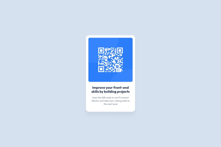
Design comparison
Community feedback
- @Psargar616Posted about 1 year ago
Hey @jacobchandy! Impressive Work on the QR code component Challenge! 🌟
I hope you're doing fantastic! I just had the chance to check out your solution challenge, and I have to say, I'm really impressed! Your work on this project is absolutely outstanding! 👍
Here's what I loved:
Stylish Design: Your design is sleek and eye-catching. The color palette and typography choices are spot-on, making it visually appealing.
I want to suggest just a few changes to get that pixel perfect design:
.component {
   //add padding and increase border-radius
    border-radius: 20px;
    width: 320px;
    box-shadow: 0 0 10px rgba(0, 0, 0, 0.2);
    padding: 10px;

}
.image img {
    margin: 10px;
   //remove 2 lines below
    /* margin-bottom: 0px; */
    /* padding-bottom: 0px; */
    width: 300px;
    border-radius: 15px;
}

also for h2 you can use color from style guide
Responsive Layout: I noticed your solution adapts flawlessly to various screen sizes, which is a crucial skill in web development.
Code Quality: Your code is well-structured and easy to follow, reflecting your strong development skills.
You're doing fantastic, and these suggestions are just meant to help you polish your skills even more. Wishing you all the best in your coding adventures! Looking forward to seeing more of your brilliant projects! If you found this feedback useful, please mark this comment as helpful
Marked as helpful0
Please log in to post a comment
Log in with GitHubJoin our Discord community
Join thousands of Frontend Mentor community members taking the challenges, sharing resources, helping each other, and chatting about all things front-end!
Join our Discord
