Design comparison
SolutionDesign
Solution retrospective
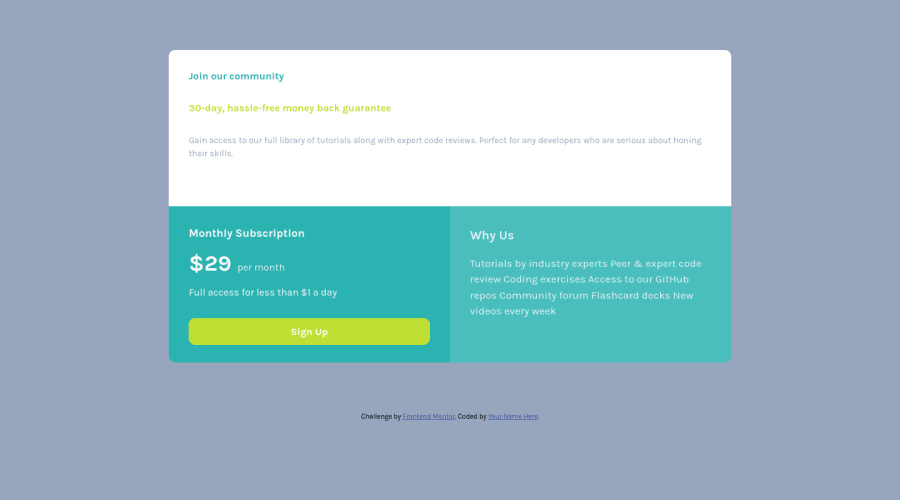
I tried using grid layout for the first time. I did not want any king of complication so i used grid for screen above 1000px and a usual flexbox for the mobile layout. Any kind of review or feedback:-)
Community feedback
- @ChamuMutezvaPosted about 3 years ago
Semantic html matters, everything cannot just be a div. Here are some elements you are missing :
- an
h1heading element - check on MDN why headings are crucial. - heading elements should ascend in order without skipping headings and an h1 being the first one followed by h2, then h3 and so forth. For font size use css.
Sign upis supposed to be an interactive element, in this case I would go for an anchor element.- the main element
Marked as helpful1 - an
Please log in to post a comment
Log in with GitHubJoin our Discord community
Join thousands of Frontend Mentor community members taking the challenges, sharing resources, helping each other, and chatting about all things front-end!
Join our Discord
