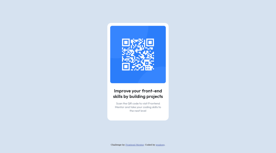
Design comparison
Community feedback
- @VCaramesPosted about 2 years ago
Hey @Pradeepsv2004, adding to what was said above/below:
- For this challenge you want to use the Image Element not the Background Image Property. The Background Image Property is mainly used on decorative images NOT images that add value and serve a purpose.
Happy Coding! 👻🎃
Marked as helpful1 - @correlucasPosted about 2 years ago
👾Hi , congratulations on your solution!👋 Welcome to the Frontend Mentor Coding Community!
Great solution and a great start! From what I saw you’re on the right track. I’ve few suggestions for you that you can consider adding to your code:
1.Something I've noticed in your code is that on many occasions you've added some
<div>to wrap contents that don't really need to be inside of a div block. Note that for this challenge all you need is a single block to hold all the content, which can be<div>or<main>if you want to use a semantic tag to wrap the content, the cleanest structure for this challenge is made by a block of content with div/main and all the content inside of it (img, h1 and p) without need of any other div or something. See the structure below:<body> <main> <img src="./images/image-qr-code.png" alt="QR Code Frontend Mentor" > <h1>Improve your front-end skills by building projects</h1> <p>Scan the QR code to visit Frontend Mentor and take your coding skills to the next level</p> </main> </body>2.The main heading has the tag
<h3>, in this case, you should replace it with<h1>since this heading is the main title on this page. Remember that every page should have one<h1>to declare which is the most important title and that you should follow the hierarchy using the heading sequence(h1, h2, h3, h4, h5)and never jump a level.3.Use
<main>instead of a simple<div>this way you improve the semantics and accessibility showing which is the main block of content on this page. Remember that every page should have a<main>block and that<div>doesn't have any semantic meaning.4.Use relative units as
remoreminstead ofpxto improve your performance by resizing fonts between different screens and devices. These units are better to make your website more accessible. REM does not just apply to font size, but to all sizes as well.Here's my solution for this challenge if you wants to see how I build it: https://www.frontendmentor.io/solutions/qr-code-component-vanilla-cs-js-darklight-mode-nS2aOYYsJR
✌️ I hope this helps you and happy coding!
Marked as helpful1
Please log in to post a comment
Log in with GitHubJoin our Discord community
Join thousands of Frontend Mentor community members taking the challenges, sharing resources, helping each other, and chatting about all things front-end!
Join our Discord
