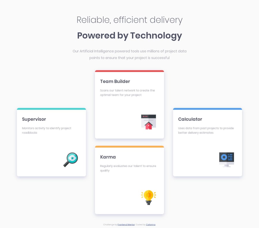
Design comparison
Solution retrospective
Still need to go through the basics of CSS. only had a brief intro that did not included grid which was I think it was essential to get to the layout. I am sure I dont get the images placement right. but wasn't able to manage it other way.
need to dive into CSS
Community feedback
- @VijayKumarKTGPosted over 4 years ago
Great Job @Catarinafs! I walked through your code and you did right. One thing I noticed was you placed the footer element outside of the body element, which is not a good practice. And as @Rfilenko said, you should work on the responsive design. One thing for sure is you did everything almost perfect although beginning with CSS3 advanced topics. Have a great time! Happy Coding! ππ€©ππ
1@catarinafsPosted over 4 years ago@VijayKumarKTG many thanks for you review. When you say responsiveness it is defining the @media right? i tried to only define to mobile it was hard π€
1@VijayKumarKTGPosted over 4 years ago@catarinafs! Yeah, it was also a little hard for me at the beginning, but I'm sure that you will get it soon. Good luck!π€©π
0 - @rfilenkoPosted over 4 years ago
Hi, overall good, but you can improve a little bit:
- semantic html, sometimes overuse of divs;
- flexbox or grid can be use to position elements inside .card, for example;
- work more on responsive beyond mobile view.
Keep codingπ, Roman
0@catarinafsPosted over 4 years agomany thanks for the assessmente. I knew nothing about grid before the challenge and still hasnt got to flexbox... looks like my life will be a bit easir when I understand how to use those well. Just started to code HTML/CSS max a week ago.
0
Please log in to post a comment
Log in with GitHubJoin our Discord community
Join thousands of Frontend Mentor community members taking the challenges, sharing resources, helping each other, and chatting about all things front-end!
Join our Discord