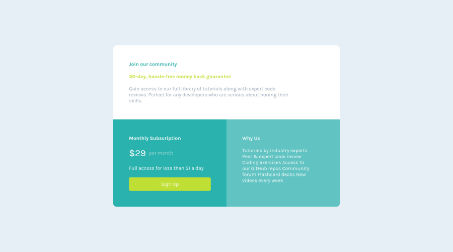
Design comparison
Solution retrospective
All feedbacks and suggestion are welcomed!! I cant align the text same as the design can someone help me with that.. Thank you!! :D
Community feedback
- @jesuisbienbienPosted over 2 years ago
Hi Prince-Rana,
-
You have a few accessibility issues that I recommend you fix. Remember to wrap everything in <main>.
-
Your response isn't good right now. The page on mobile view got cut off at the top and bottom. I guess it maybe due to using absolute positioning. I used grid and flex for my solution. Here's what I did for my solution. Nguyen's solution
-
In the Why Us section, you should use <ul> for the information. Right now, they're treated as a paragraph so it doesn't break into a new line when it needs to.
-
I recommend you start using the toggle device toolbar, it's very helpful when you want to check how your site looks like in different dimensions. Youtube - toggle device toolbar
Hope this helps.
Nguyen
2 -
- @Prince-RanaaPosted over 2 years ago
Hi Nguyen. I have tried making some changes that you have mentioned. Could you take a look again and tell me if its better now?. If there is any problem. Help me again :D. Thank you.. Here is the link to my updated solution https://imaginative-starship-0c422b.netlify.app
0@jesuisbienbienPosted over 2 years ago@Prince-Ranaa Hi Rana, I've just checked your updated solution. I think it looks good now. Though I'd size down the width of the main component on mobile view a little so it's away from the edges. (check it under iphone SE dimension) Sorry I missed your reply. Next time, just reply directly to my comment, otw I won't be able to receive a notification that you reply. :D
Happy coding!
0
Please log in to post a comment
Log in with GitHubJoin our Discord community
Join thousands of Frontend Mentor community members taking the challenges, sharing resources, helping each other, and chatting about all things front-end!
Join our Discord