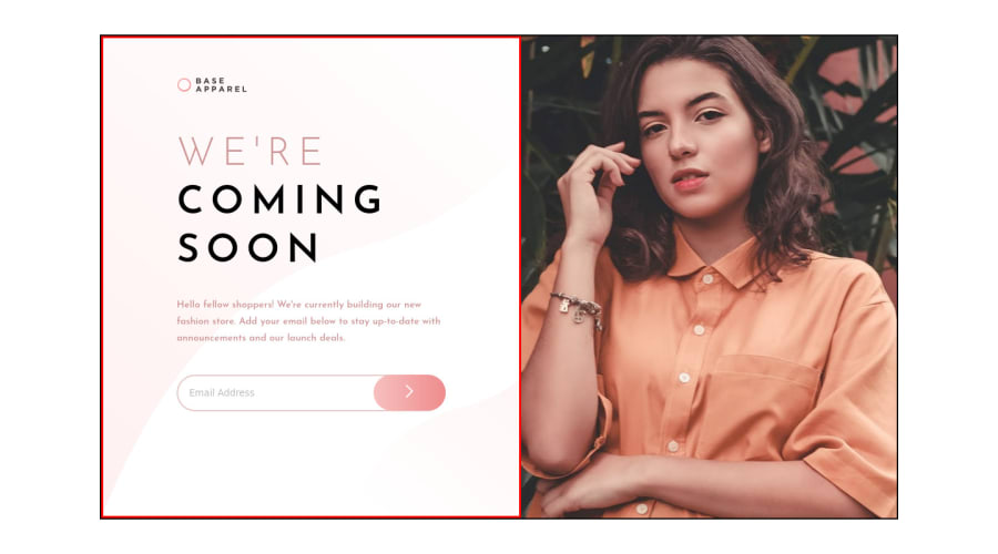
Design comparison
Solution retrospective
Feedback are always welcome !!!! Any suggestion that could improve the solution? Thank you for your time!!
Community feedback
- @kirtymeenaPosted about 3 years ago
@Prince-Ranaa Hi, I think you forgot to remove the borders that are not part of the design. apart from that, it looks good.
Marked as helpful0 - @Ging3rmintPosted about 3 years ago
To scale an image properly, you would want to apply the object-fit property. in your case, use object-fit: fill
1@Prince-RanaaPosted about 3 years ago@Ging3rmint where do I need to add it I don't know this property. Could you link a site where I could learn more about it. It will really be helpful. Thank you....
0@Ging3rmintPosted about 3 years ago@Prince-Ranaa Add it into your img css stylesheet. This stuff comes naturally after a few practise, if you really want to read up you can check out w3 school on image scaling. :)
1
Please log in to post a comment
Log in with GitHubJoin our Discord community
Join thousands of Frontend Mentor community members taking the challenges, sharing resources, helping each other, and chatting about all things front-end!
Join our Discord
