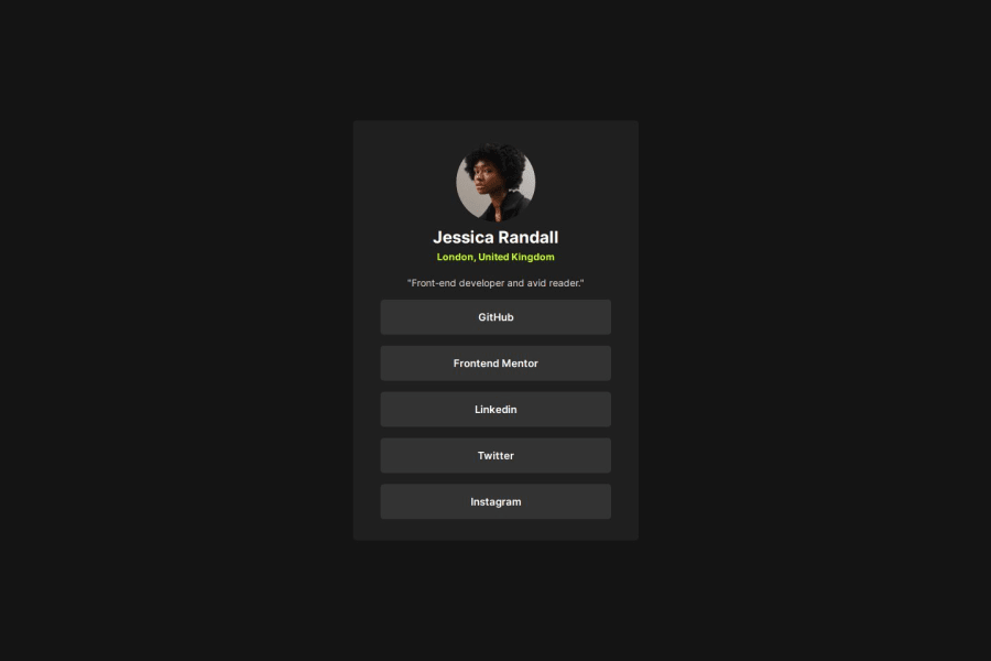
Design comparison
Solution retrospective
I am proud to have worked with CSS media queries.
What challenges did you encounter, and how did you overcome them?The challenge was to work with CSS media queries so that the component does not break its fluidity when it grows.
What specific areas of your project would you like help with?I would like to receive help to know if I am practicing good CSS practices.
Community feedback
- @Grego14Posted 10 months ago
👋 Hello! 🎉 Congratulations on completing the challenge! 🎉
Remember to specify a more descriptive alt attribute, as it is commonly used by screen readers, no one wants to listen to 'photo profile'. Something like this 'Jessica Randall photo profile' would look better.
You're using two media queries unnecessarily. You have two for 600px and two for 750px.
Move the media querys to the end of the file and add the styles from the a element to the media query where you add the styles to the .main-container.
@media screen and (min-width: 750px) {
  .main-container {
    padding: 2rem;
    height: 610px;
    width: 415px;
  }

  a {
    font-size: 15px;
    padding: 16px 0;
  }
}
This would save code and simplify the use of media queries.
hope this helps! 😁
Marked as helpful0
Please log in to post a comment
Log in with GitHubJoin our Discord community
Join thousands of Frontend Mentor community members taking the challenges, sharing resources, helping each other, and chatting about all things front-end!
Join our Discord
