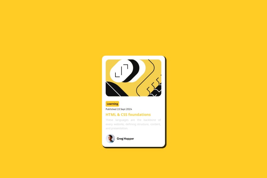
Design comparison
Solution retrospective
I’m most proud of successfully implementing the responsive design and ensuring cross-browser compatibility. Next time, I’d focus on optimizing performance and adding more interactive elements to enhance user experience.
What challenges did you encounter, and how did you overcome them?I struggled with integrating media queries for a consistent mobile view. I overcame this by thorough testing across devices and using flexible layouts to adapt to different screen sizes..
What specific areas of your project would you like help with?I struggled with integrating media queries for a consistent mobile view. I overcame this by thorough testing across devices and using flexible layouts to adapt to different screen sizes.
Community feedback
- @SvitlanaSuslenkovaPosted 2 months ago
body { display: flex; flex-direction: column; justify-content: center; align-items: center; min-height: 100vh; } Try this to align(top-bottom) and justify(left-right) your project to the center. It applies to the parent component(body), don't forget about !!min-height!!. You can use grid instead of flex too.
Hope you found this comment helpful :)
Marked as helpful0 - @StroudyPosted 2 months ago
Amazing job with this! You’re making fantastic progress. Here are some small tweaks that might take your solution to the next level…
-
This does not matter that much at this stage but something to be mindful of for SEO(Search Engine Optimisation),
<meta>
description tag missing. -
Using a
<main>
tag inside the<body>
of your HTML is a best practice because it clearly identifies the main content of your page. This helps with accessibility and improves how search engines understand your content. -
Using
max-width: 100%
ormin-width: 100%
is more responsive than justwidth: 100%
because they allow elements to adjust better to different screen sizes. To learn more, check out this article: responsive-meaning. -
Developers should avoid using pixels (
px
) because they are a fixed size and don't scale well on different devices. Instead, userem
orem
, which are relative units that adjust based on user settings, making your design more flexible, responsive, and accessible. For more information check out this, Why font-size must NEVER be in pixels or this video by Kevin Powell CSS em and rem explained.- Another great resource for px to rem converter. -
Having a clear and descriptive
alt
text for images is important because it helps people who use screen readers understand the content, making your site more accessible. It also improves SEO, as search engines usealt
text to understand the image's context, helping your site rank better, Check this out Write helpful Alt Text to describe images, -
Using a full modern CSS reset is beneficial because it removes default browser styling, creating a consistent starting point for your design across all browsers. It helps avoid unexpected layout issues and makes your styles more predictable, ensuring a uniform appearance on different devices and platforms, check out this site for a Full modern reset
-
Using a naming convention like BEM (Block, Element, Modifier) is beneficial because it makes your CSS more organized, readable, and easier to maintain. BEM helps you clearly understand the purpose of each class, avoid naming conflicts, and create reusable components, leading to a more scalable codebase. For more details BEM,
-
Using
margin-inline: auto
is better thanmargin: auto
for centering elements horizontally because it is more precise. To center an element, set its width and applymargin-inline: auto
; this will center it within its container., You can center the height by using this code snippet
min-height: 100svh; display: flex; justify-content: center; flex-direction: column;
You’re doing fantastic! I hope these tips help you as you continue your coding journey. Stay curious and keep experimenting—every challenge is an opportunity to learn. Have fun, and keep coding with confidence! 🌟
Marked as helpful0 -
Please log in to post a comment
Log in with GitHubJoin our Discord community
Join thousands of Frontend Mentor community members taking the challenges, sharing resources, helping each other, and chatting about all things front-end!
Join our Discord