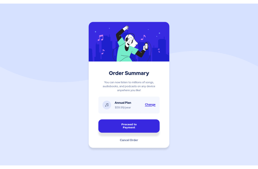
Design comparison
SolutionDesign
Solution retrospective
This is my first challenge I welcome all feedbacks and some suggestions and tips, My Question is as a beginner should I use Media Query for responsive design or should I jump to other tool?
Community feedback
- @UDsGitHubPosted almost 3 years ago
Hi Gelo, Your site looks good. Here are a few things you could do to improve your work.
- Instead of selecting all possible html elements in the page, you could use the " * " selector so select all the elements like so
*{ margin: 0; padding: 0; border: 0; font-size: 100%; font: inherit; vertical-align: baseline; }
- To improve semantics and accessibility, you could wrap your main card content in the main element and give it the class or id of main like you already have on that div.
- You should have a
background-size: cover
on your body's background. - I noticed you have a lot of multiple selections on elements you wanted to style like for example "article, aside, details, figcaption, figure, footer, header, hgroup, menu, nav, section { display: block; }" You want to try and avoid long selections like that because it reduces the readability of your code. other than that, the rest of your code looks pretty good, only other thing I'd pick on is maybe adding some transition duration for your hover effects. Good luck! 👍
Marked as helpful0@gelo29Posted almost 3 years ago@UDsGitHub Thank you for the feedback sir! i'll take note of these.
0 - Instead of selecting all possible html elements in the page, you could use the " * " selector so select all the elements like so
Please log in to post a comment
Log in with GitHubJoin our Discord community
Join thousands of Frontend Mentor community members taking the challenges, sharing resources, helping each other, and chatting about all things front-end!
Join our Discord