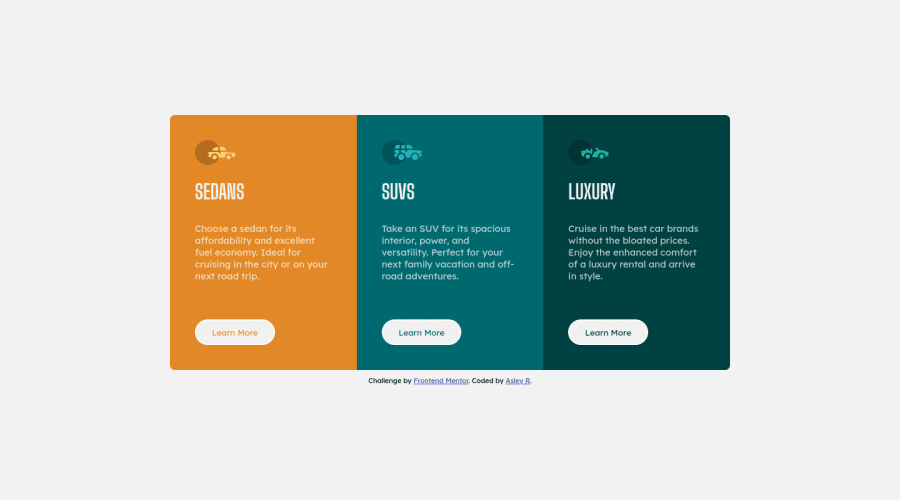
Design comparison
Solution retrospective
I learned a lot about how to make responsive designs.
-
Does it matters that much that if it is not scale up to big screens? (think 4k screens and alike)
-
Are the responsive units I used properly used?
Thanks in advance for any feedback :)
Community feedback
- @HYDROCODERPosted over 3 years ago
Hey there! Good work on this one. There are a few things I would suggest if you don't mind:
-
You have defined many media queries (3 to be precise). As a result, the cards are overflowing at one breakpoint (around 540px) and at some others it is sort of getting crushed, and since you have used overflow: hidden, it is disappearing to the right. Try taking up a mobile first approach. In this challenge, there are three cards and they all cannot fit in one row unless its a wider screen like a laptop. After completing the design for mobile, you can set the media query for larger screen sizes, and I guess just one media query would be enough, at around 1000px. If you wish to, you can define one for a tablet as well and put two cards in one row and center the third in another row using css grid, but I guess for this challenge just one is sufficient.
-
"Does it matters that much that if it is not scale up to big screens? (think 4k screens and alike)". While such screen sizes are rare, you can still manage to just put in a max-width on your main-wrapper and it will not stretch beyond it. It will just appear zoomed out a bit.
-
You centered your main-wrapper using equal margins to the left and right. Use a percent width instead like 90% or 80% and set the margin to 0 auto. It will be centered horizontally and you don't have to worry about what values to put in the margin anymore, as you can toggle around with just the percent width.
-
"Are the responsive units I used properly used?": Try using em for padding. It will scale with the font-size of your element if you ever set it to something different, and it will still look have the same spacing around it. For margins, you can use ems too, but I usually prefer using rems for margins as I don't want spacing to scale up or down with font-size, and I want to be more conscious about the spacing between elements. For font-sizes, you may use rems but never use em, it can get real messy with em.
Hope it helps :).
Marked as helpful2@AsleyRPosted over 3 years ago@HYDROCODER Thank you very much for this well detailed feedback. Having a mobile first approach for the design is something I did not think through. I now see how useful that approach will be in the future.
Your tips for responsive units was quite useful in setting some things clear for me.
Thanks again for taking the time to review my solution :)
0 -
Please log in to post a comment
Log in with GitHubJoin our Discord community
Join thousands of Frontend Mentor community members taking the challenges, sharing resources, helping each other, and chatting about all things front-end!
Join our Discord
