

Design comparison

Solution retrospective
I'm most proud of putting my head down and working through this project. My HTML and CSS skills are still very basic, but I feel that I am learning and growing.
What challenges did you encounter, and how did you overcome them?I had challenges with the hover aspects of the project, but it was fun to work through it.
What specific areas of your project would you like help with?I would like help with the focus aspects of the project. Thank you!
Community feedback
- P@joeleg96Posted 27 days ago
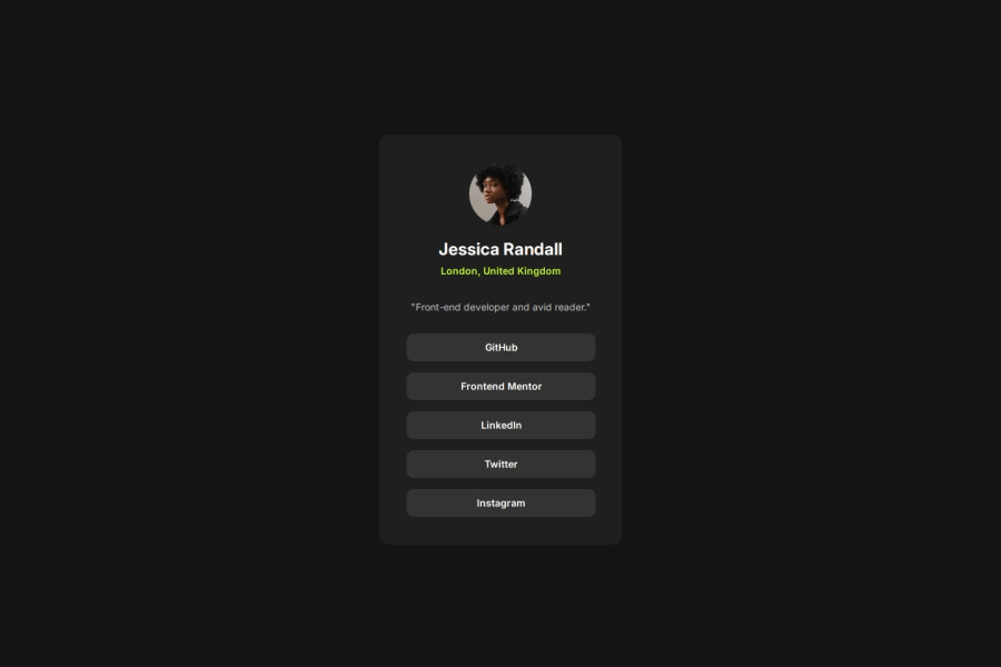
Overall your solution looks like the design that was provided. One thing that I found interesting about your code was that you used "li" along with anchor tags when doing the media section. Another solution, which is the way that I did it, could be to use the button element in your HTML, and put all of the buttons inside of a container div. Then in your CSS you could display: flex; and flex-direction: column; that way you can get them to stack up vertically. Just another possible way to tackle to same problem. Hope this helps, and good luck with your future coding projects!
Marked as helpful1P@pdoubleu30Posted 27 days ago@joeleg96 Thanks, Joel! I appreciate the feedback and the alternative way to work this project. Good luck to you as well!
0

Please log in to post a comment
Log in with GitHubJoin our Discord community
Join thousands of Frontend Mentor community members taking the challenges, sharing resources, helping each other, and chatting about all things front-end!
Join our Discord