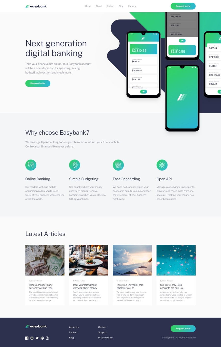
Design comparison
SolutionDesign
Solution retrospective
Any feedback is welcomed
Community feedback
- @RocTanweerPosted almost 4 years ago
Hello 👋 I have done this project today...
I am afraid to say but your site needs improvement... Some of them, I will point out...
-
When ham button is toggled, the overlay is not covering the whole screen and not making a gradient effent...
-
font size need no be checked...
-
You may [visit] (https://esybank.netlify.app) to see my project and just as I suggested you, you can also suggest me...
Hope it helps!
0@consolexyzPosted almost 4 years ago@RocTanweer thank you so much i will fix as soon as possible
0 -
Please log in to post a comment
Log in with GitHubJoin our Discord community
Join thousands of Frontend Mentor community members taking the challenges, sharing resources, helping each other, and chatting about all things front-end!
Join our Discord
